Procept Careers Website
Procept was in need of a new careers microsite to keep up with the demand of new job openings. The client wanted something completely modern and eye-catching to grab the attention of future candidates, so they gave me the keys and said get a crazy as your imaginations allows you to. As a designer that was music to me ears!
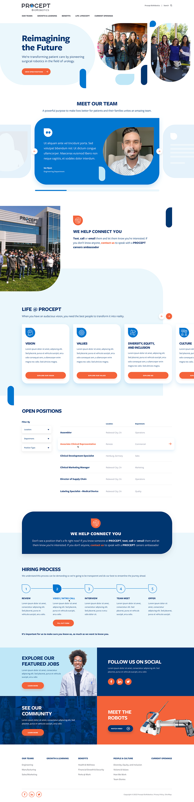
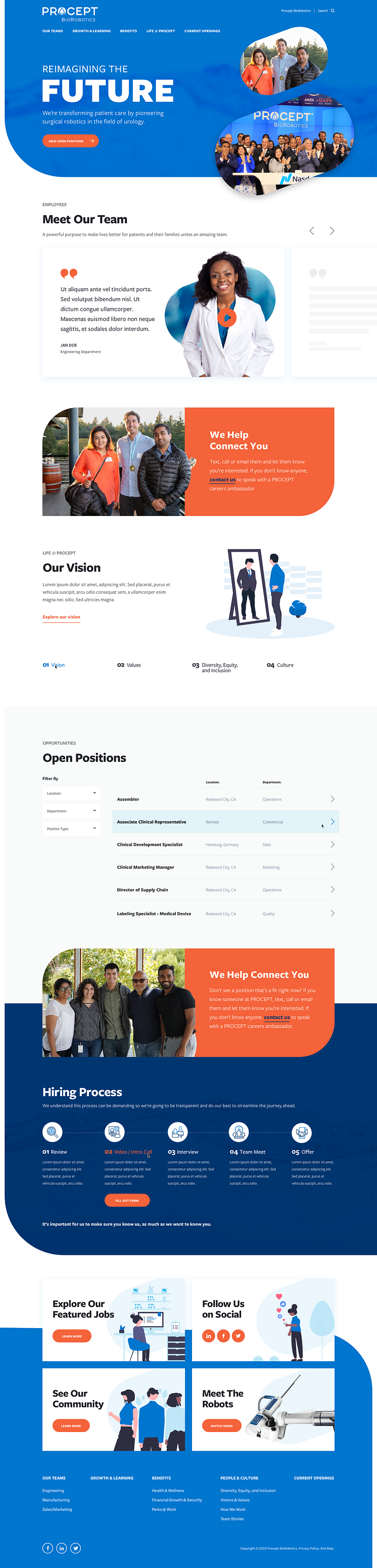
I began with asking myself "what makes Procept, Procept?" which working with them on previous projects with them was really easy to answer... Water! The source of their state-of-the-art Aquablation Therapy; a one-of-a-kind procedure. It is the only procedure that uses a heat-free waterjet controlled by robotic technology to remove prostate tissue.
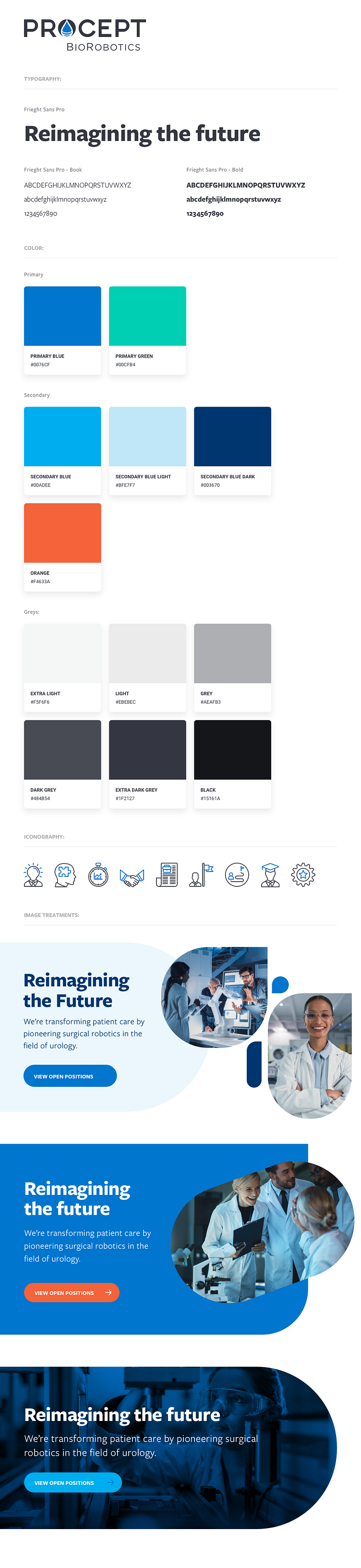
Style Tile
The water-drop, which was already part of the Procept logo, would become the main component of this new brand-identity I create for this career centric microsite.
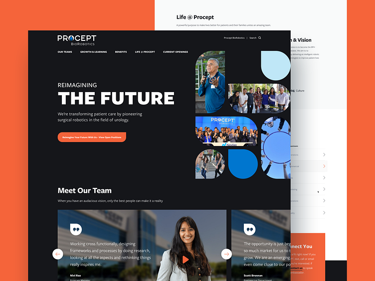
Homepage Concepts
Once the style tile was approved, it was time to flush out some homepage concepts that incorporated the styles the client loved in three different executions.
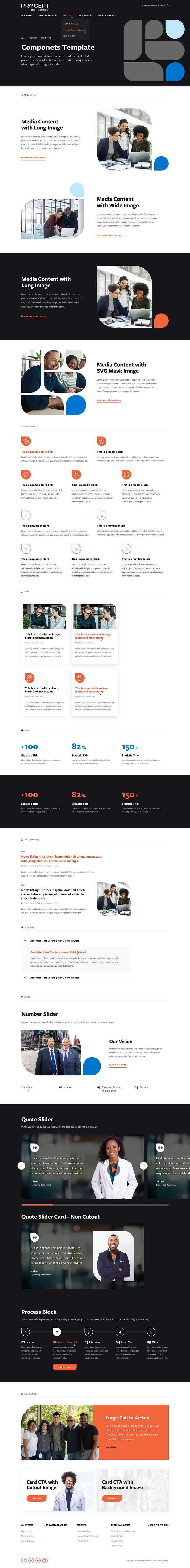
Stylesheet & Components Template
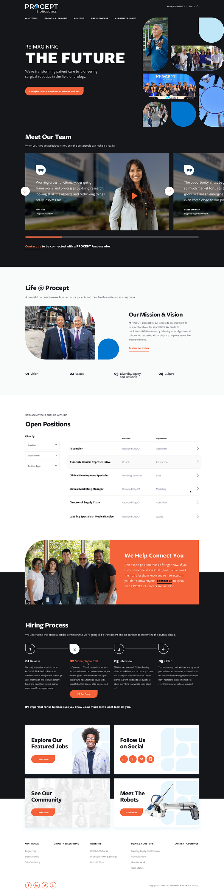
All though Concept 1 was my favorite, the client gravitated towards Concept 3 which utilized a dark UI and best represented the new direction of the company.
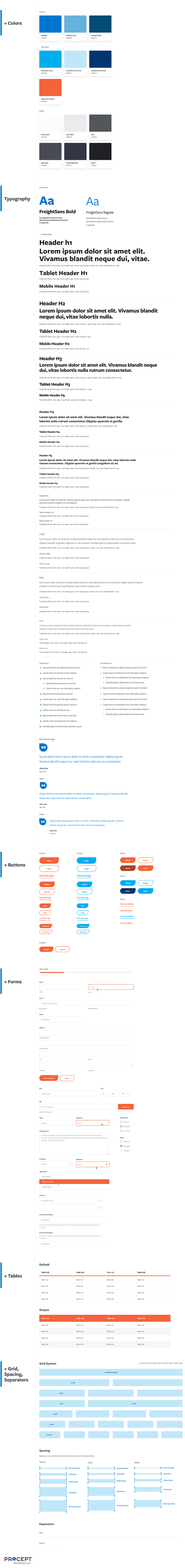
Now that the homepage was approved, It was time to create a stylesheet and a components template. These two mockups would lay the ground work for the whole site so it was important that what the client loved about the homepage was carried throughout the whole website.
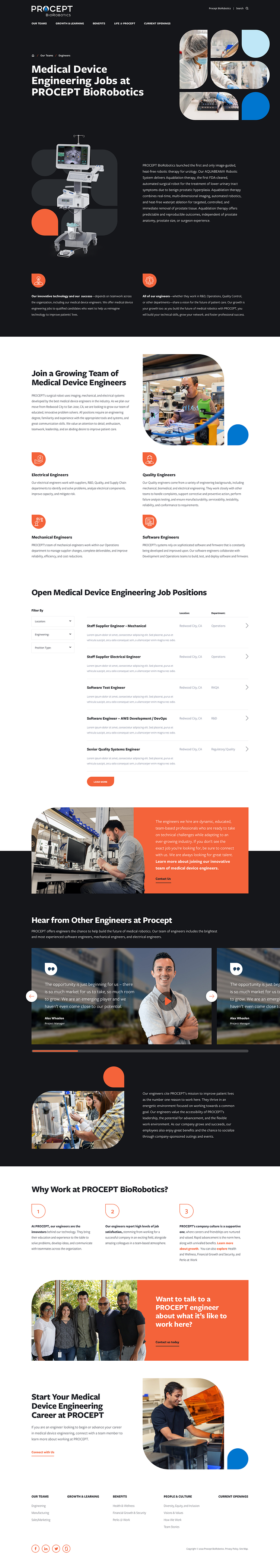
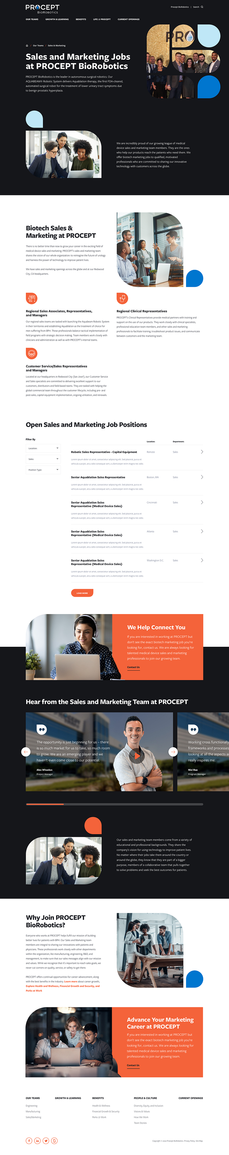
Interior Design
Here are some examples of the interior page designs with in the Procept Careers website. Click Here to see the whole website !