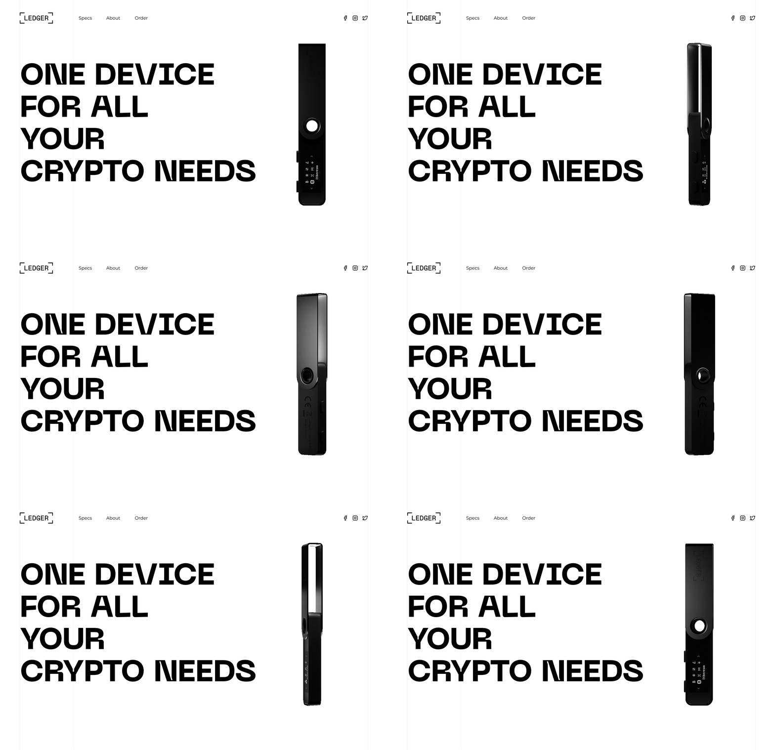
Ledger Wallet - Redesign concept
When it comes to design, our team likes to experiment. Our newest redesign concept shows a landing page for the Ledger website. This redesign idea displays a simple, clean, and neat layout design. From a fresh perspective, our idea of a renewed version of this landing page provides users with a smoother experience.
We wanted to go big - that's why we used corresponding typography, and the Neue Machina typeface was an obvious choice.
All materials used are for non commercial purposes and belong to the original owners.
Like this shot?
Find out more about what we do at Barrage.
More by Barrage View profile
Like


