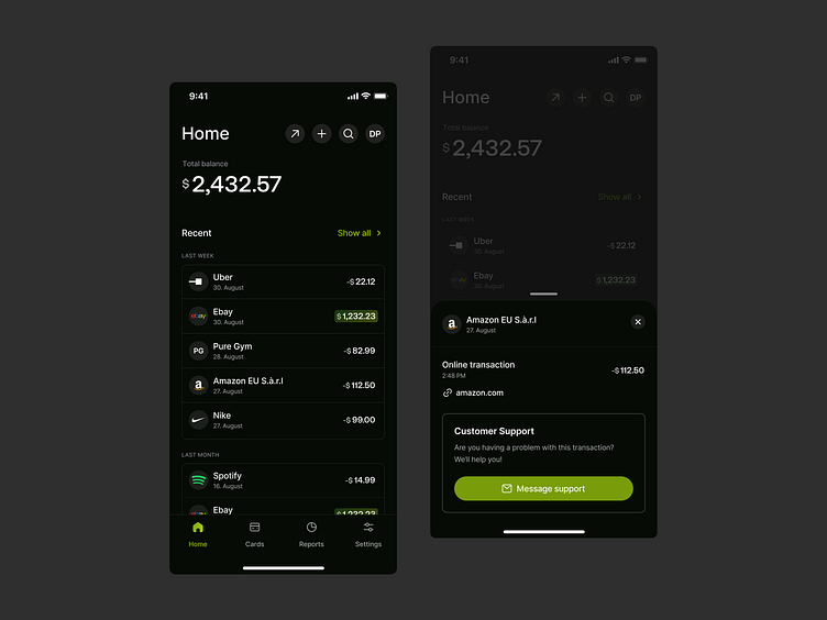
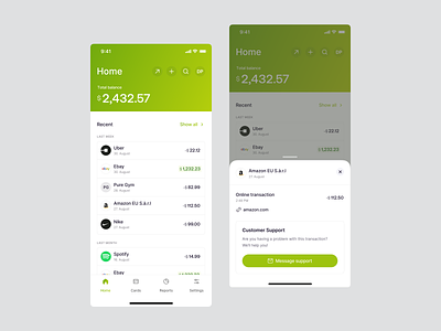
🌘 Dark Mode - Banking Dashboard iOS
Hi Dribbblers 🏀,
today I want to share with you the dark mode of the finance dashboard of a banking app that we recently designed.
Did you notice that I highlight the positive values while I don't do that with the negative ones❓
There are two reasons for this.
✅ The obvious one: I want to have a positive influence on the user by highlighting positive values.
✅ The not so obvious one: People who are colour blind and have difficulty distinguishing between red and green can now easily distinguish between positive and negative values.
About us
Fintory is a design and development agency specialized in creating simple and performant user experiences for startups and the world’s leading companies.
Services we provided:
— UX/UI Design
— Web Design
— Responsive Design
— Market Research
— Brand Strategy
— Visual Identity
— 3D Design
— Design System


