Bank fraud - case study
Chase is a well known bank in the USA. As with many other banks, a feature they offer is to watch for fraudulent charges. A user will be notified if their bank detects (or suspects) a fraudulent charge on credit cards or debit cards.
The problem
(A real problem that happened, names are omitted to protect the innocent)
A user received 2 notifications from a bank, but wasn’t sure if the notifications were from a legitimate source, or were themselves fraudulent (or spam) notifications.
The user had been receiving an influx of spam text messages, and the email “appeared to be off.” Neither the mobile app nor desktop app contained any notifications about fraud. The only way to contact the bank was to make a phone call. This user is a Millennial and strongly prefers chat experiences for customer support.
After making a phone call to the bank, the user was able to determine that the notifications were legitimate and was able to inform the bank that the charges were in fact fraud.
After confirming the charges were fraud with the bank, no further notifications were received by the user, leaving her uncertain about what actions the bank was taking (examples might be canceling the account or card, and if so, whether a new account or card were going to be processed).
The challenge
Improve the customer experience to make it easier for the user to identify that the bank notifications were legitimate.
Improve accessibility to customer service.
Communicate with the user the actions that the bank would take after the fraudulent charges were confirmed.
Research
I thought it was best to start with an understanding of how banks commonly communicated with their customers in regards to fraud. As expected, I found that they all try to alert their users with either text, email, push notifications, or all. The general advice was to take care with any texts or emails that may seem suspicious, and not to offer any personal details in reply, as most banks would not ask for this information.
However, there was no consistent form of communication that would alert the user in a way that they could consistently feel comfortable and safe with where it came from.
I asked other potential users. Luckily, almost everyone uses a bank and many have had experience in potential (and actual) fraudulent activity.
Finding solutions
The most reasonable solution(s) seemed that:
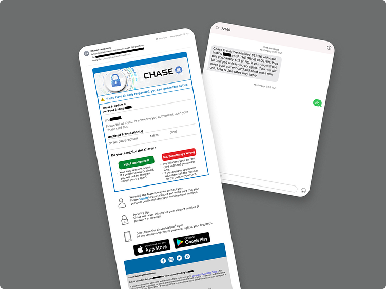
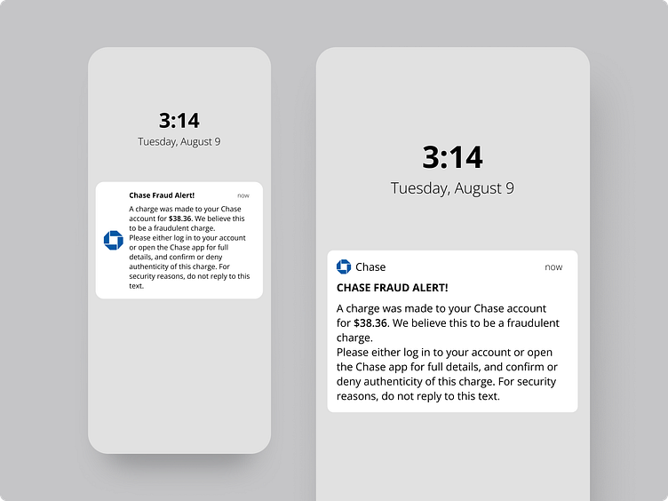
a: A fraud alert should show up in all 3 ways – text, email and push notification.
b: It should be a directed message that asks for action without asking for a direct reply or personal information.
c: The direction from the various alerts should reflect the same “red flagging” in the website and app.
So where does that take the design?
The task at hand:
Design push notification and email text
Design email notification (this ultimately was omitted due to redundancy)
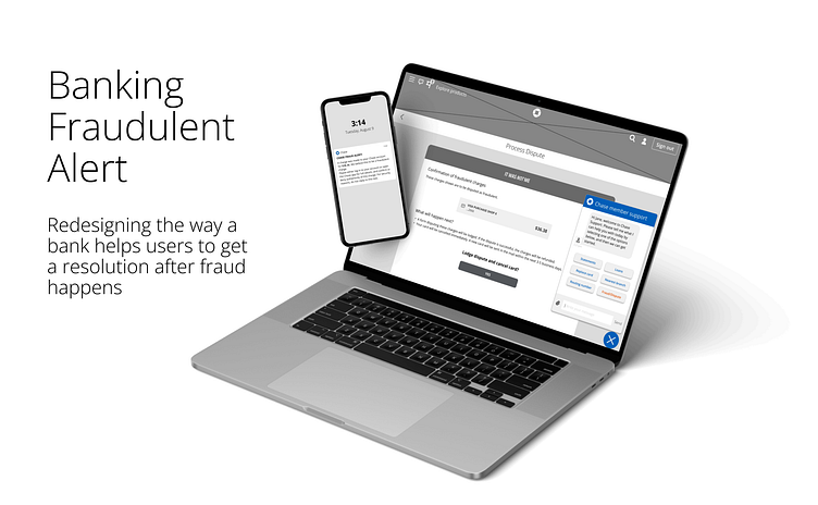
Design both app and website pages in flow for fraud resolution
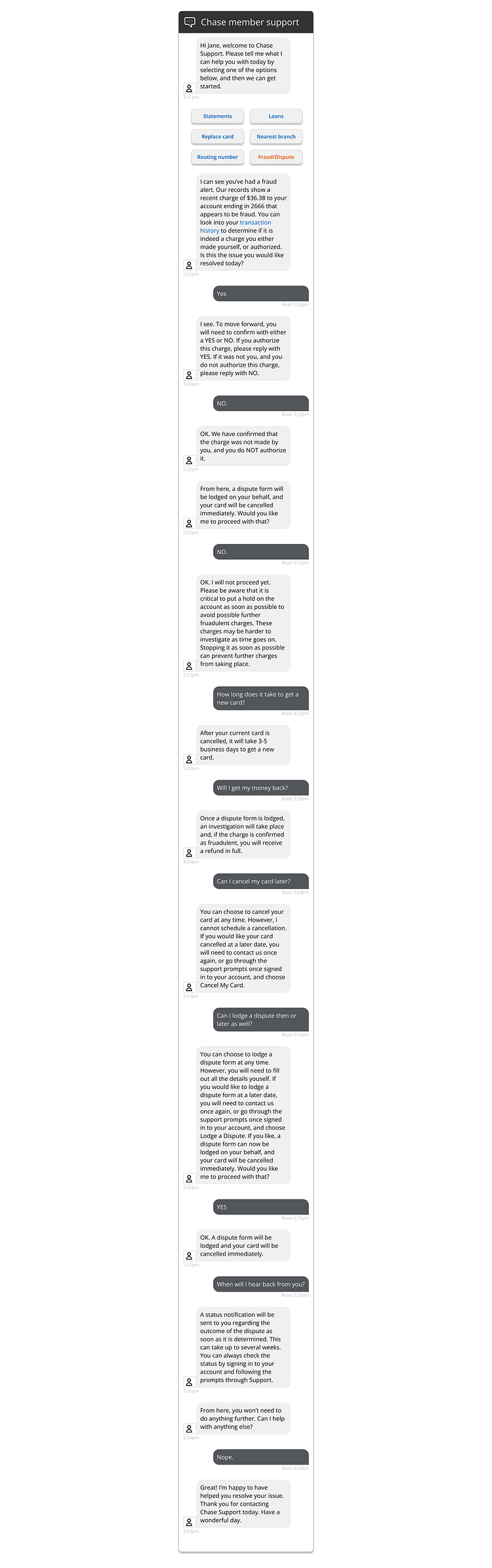
Essentially this suggested that I needed to engage in experience design, drilling down into copy and user flow. In order for me to succeed in creating a secure and safe experience for the user, the language needed to be specific and the direction obvious.
Since I had relatively little experience in copy, this was going to be a big challenge. These are automated messages, not only in an alert but also through a chat bot within the banking app. How could I create automation to answer questions and solve problems without needing an actually human responding to the user?
I didn’t know...yet. So, more research. I used a lot of chat bots.
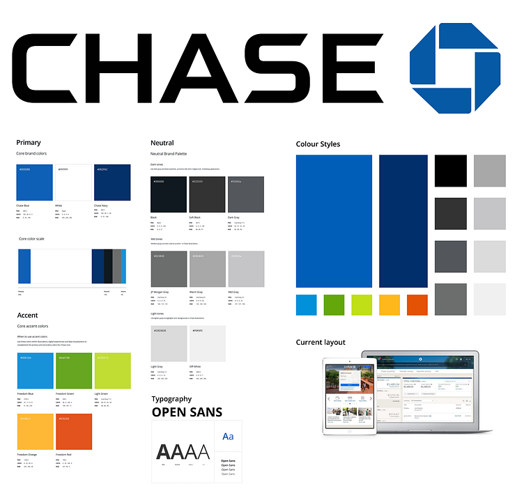
Other research - branding
In this case, I did not need to reinvent the wheel. Chase already has plenty of branding, so I just needed familiarity with it. I “chased” it down in every form I could (I know, bad pun, but it had to happen somewhere in this case study, and I swear it’s out of my system now), from the actual site, of which I am not a member, and various other case studies.
I needed to make sure that the layout was aligned with Chase, and of course branding would be important to ensure credibility.
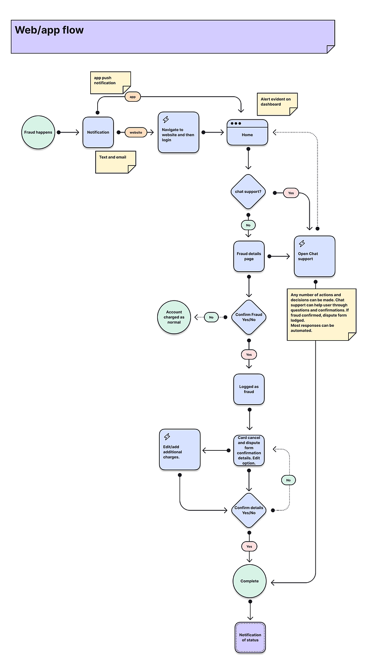
User flow
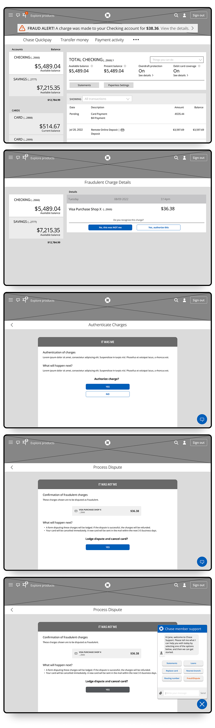
Importantly, I felt that the flow needed to be the same whether through website or app. In both ways, it needed to be relatively simple with enough information that the user could quickly take action and reach a satisfactory resolution.
I didn’t get this right first time, mostly due to incorporating too many diversions, but I kept the ability to resolve the issue through chat help as an essential part of the flow, and an option for users with reservations or questions. I did my utmost to keep with Chase policy in dealing with fraud, specifically with dispute forms and card cancellation.
Designing the alerts
Another vital element, before the wireframes, I needed the alerts to be right. Originally I considered pushing user action by giving a time limit to act before the card would be automatically cancelled, but decided against this since it made it appear more scam-like. The trick here was to say just enough without asking too much.
Wireframes
Wireframes needed to offer direction on how to progress from the alert. All direction took the user to either the website or the app. From there it was a series of informed confirmations, with the only exception being the ability to chat.
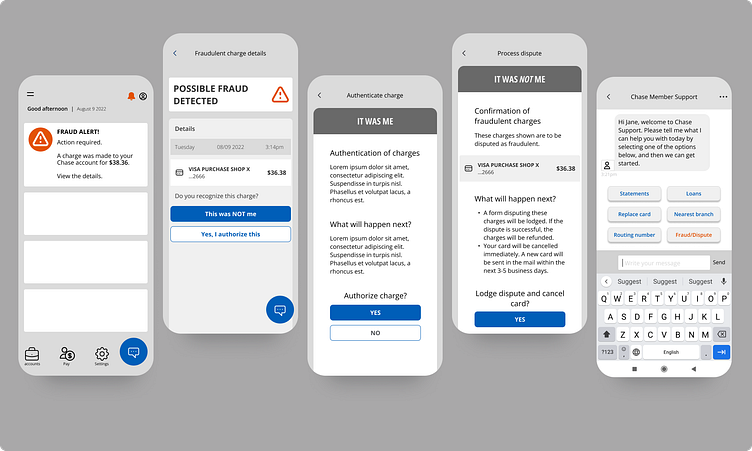
In order to have a better understanding of how effective this direction would be, I raised the fidelity in a couple of screens. It was actually so effective in highlighting the flow, I continued this in every screen.
Chat help
The final piece of this was the chat bot communication. There were multiple versions of this initially, but the final version, as with many things, was the simplest way to offer chat bot help. Pre-emptive communication is a skill not for the faint of heart, but worth the trial and error, as it saves on resources for both the bank and the user.
Here it is in long form.
Conclusion
The big take away for me was strengthening some wireframing and user flow skills, as I have been generally invested in visual resolutions, and also creating copy. We as designers are often very visual people, and understand well how to communicate visually, but communicating in the copywriting realm is its own beast, and has been something I have usually avoided, until now.