Client Branding
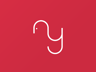
Working on some branding for a new client. The logo is based purely on geometric shapes. Using the I/O as devider for the A and letting the stroke of the a flow into the Y, to portray a sideview of a face to accentuate personal approach between the company and his clients.
More by Rob Voets View profile
Like


