Hug Nature Case Study
Overview
Hug Nature is a low impact eco store focused on providing sustainable alternatives to daily use products. It strongly believes that even a small-everyday swap can have a great impact. And that is the soul of Hug Nature. Spreading awareness. Providing solutions. And encouraging mindful consumption. Also, Hug Nature is all about how to make the sustainable lifestyle more fun!!
Creative Direction, Branding, Packaging and Social Media

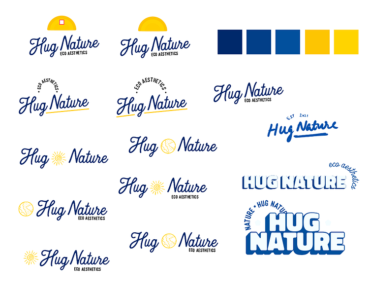
Logo Process
Hug Nature was built to resonate with the fun side of the consumer without sacrificing their sustainability goals hence the bright colours. Most brands in the sustainability industry tend to gravitate towards greens and browns as their primary brand colours. But I wanted to break the stereotype for Hug Nature and create a brand that would connect with the youth more effectively.
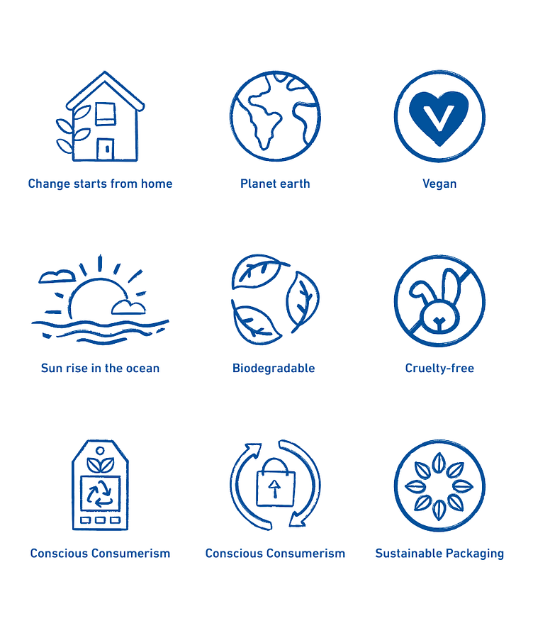
Brand Elements
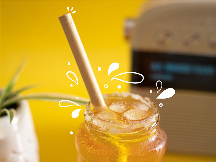
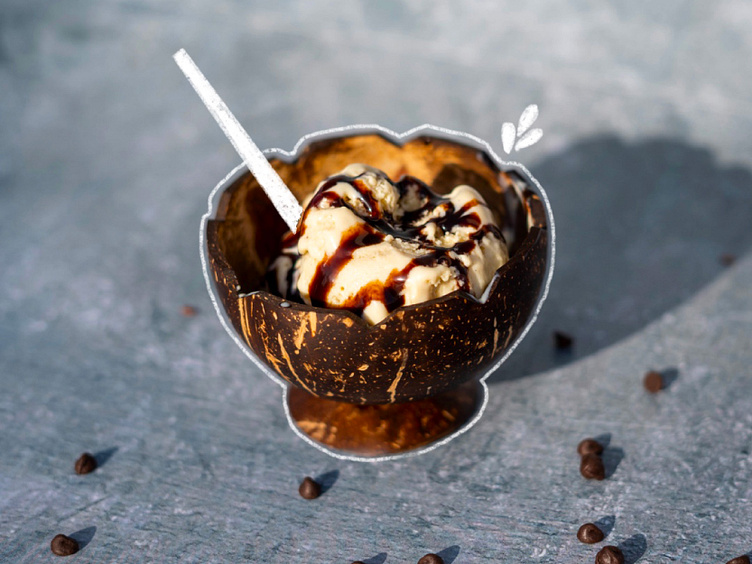
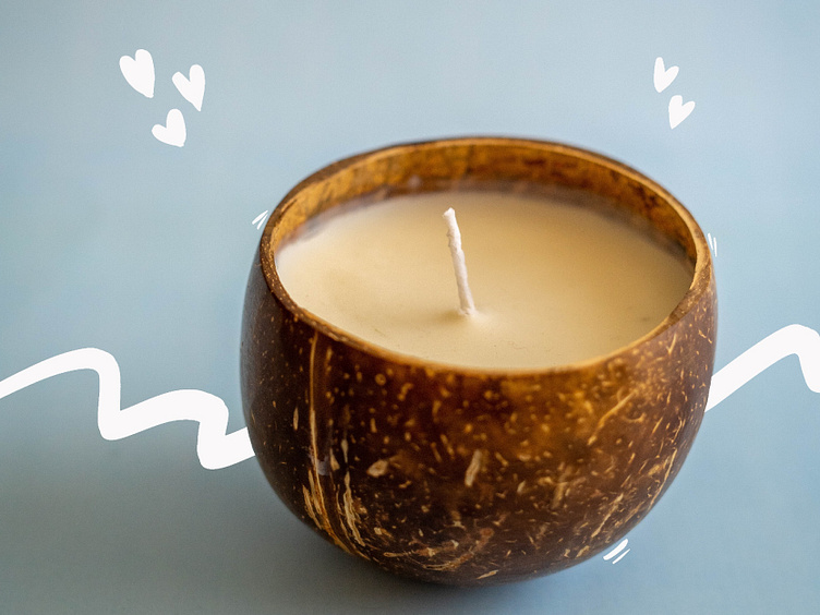
Brand elements were crucial for Hug Nature as one of the goals was to have a solid digital presence. I recognized that the logo could not be overused, and those brand elements could share the load in establishing the brand. I went for hand-drawn elements to make the brand feel more casual and fun.
Final Outcome
Logo
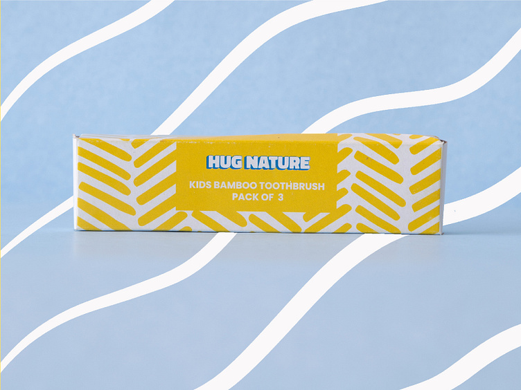
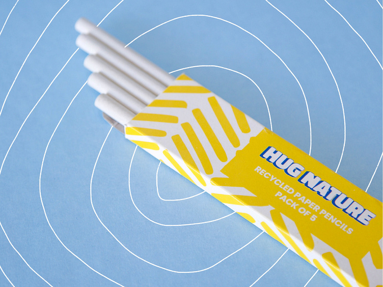
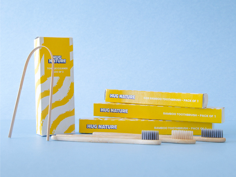
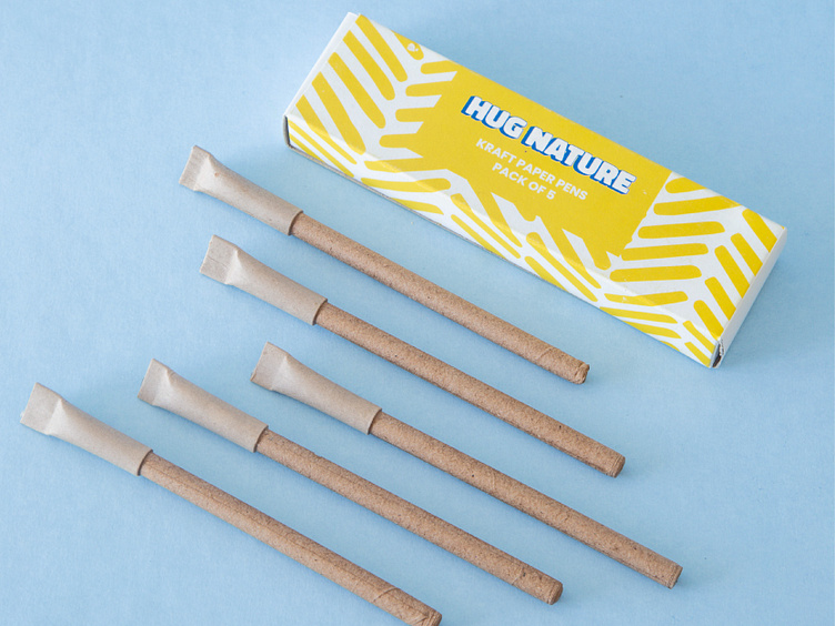
Packaging
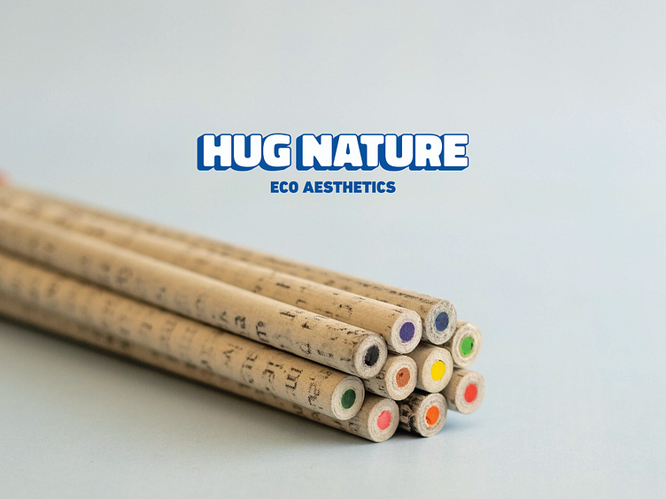
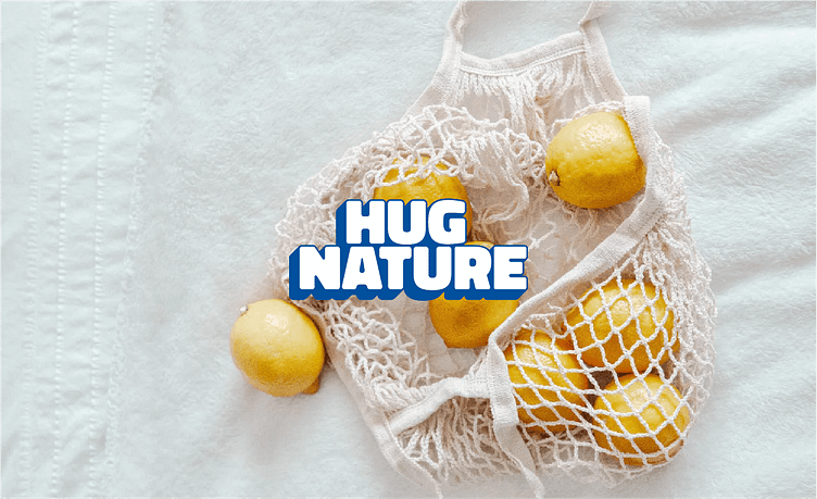
Social Media & Brand Photography
Learning Outcomes
Hug Nature is one of the most significant projects I have undertaken in the past year, and I have learnt a lot. Some important lessons I learnt:
It might seem intimidating to try something different than the industry standard for a brand, but the results are worth it.
A full-fledged knowledge of the printing process from design to paper in India.
How to properly plan and execute a brand photoshoot.
