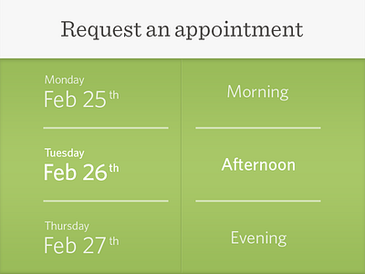
Booking Appointment Shot
There are a few things bugging me about this screen:
1. The selected state isn't obvious enough.
2. It doesn't seem immediately obvious that I can dial the two columns
3. The date/time picker feels like an interruption in the UI instead of a natural part of it.
More by Matt Donovan View profile
Like

