Cloud Kitchen – Station
💌 Have a project idea? We are available for new projects!
hello@ronasit.com | Telegram | WhatsApp | Website
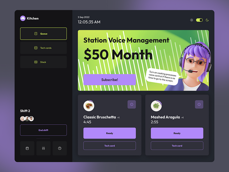
Hi all! Meet our new concept of an app that could help the restaurant staff to streamline their work. It provides chefs with information about ordered dishes and voice assistance. Let’s explore the screen in detail.
On the left, there is a bar that allows users to switch between app tabs. Next to it, there is an advertising banner and a list of cards that display the names of dishes and their status.
Keeping the background dark, we accented the main UI elements with green and purple. Green shades look vivid and they are often associated with food, while purple is usually associated with high tech.
Using this app, users can switch between light and dark modes of the interface. So, this app can be used at any time and place. To make the app simple to navigate, we decided not to overload it with UI elements.


