Travel Application
Hello There
I experimented with and idea I had for a travel application. The process was quite enjoyable and didn't take me long to map out the idea into a design. This is the story. Hope you like it!
Colouring
Having multiple colours in a design can be distracting to a user especially when the application will display images such as landscapes. Colours attracts attention. That is why I decided to use black & white as the primary colours and add a dark green for variety.
Layout
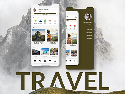
If not carefully planned the layout of a design can be confusing to understand or even hard for the user to tap the right buttons. I came up with the idea to create a slide search bar that will slide open from underneath the header. This also allowed me to create more space around other icons and buttons so that users can move around the application freely.
Categories, located below the header, is for users who prefer to browse by categories and find which places are good to travel to and what events will take place in the duration of their visit.
-
The Popular category helps users to find the most popular places to see within a country.
The Hire category allows users to book a guide and/or vehicle they would like to use for the duration of their stay within a country.
By tapping on the burger icon, users will have the options to create a to-do-list of all the places they would like to see, Save a location or sight to favourites so they don't lose it or edit their account settings.
The design of this application is very simple so that it is easy for users to find what they are looking for. However it still lacks in certain areas such as usability for disabled people. But apart from that I am happy with the direction it is going.
Thank you for reading, I hope you enjoyed!
Checkout my Instagram Design profile
For entertainment here's my Photography profile
