Eden Visual Identity
Eden sells clean, healthy, yummy food and bev. Their vibe is organic, honest.
The scope of their rebrand included a ground-up redesign of logo set, icons, badges, and illustration, as well as messaging, romance copy, and a range of packaging designs for their premade products.
Logos
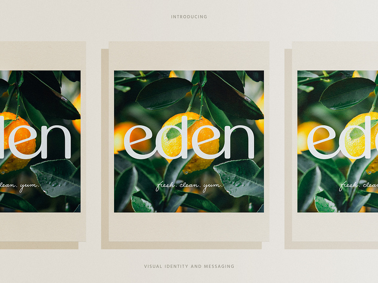
In alignment with Eden's high-class yet approachable vibe, we opted for a custom-built, all-lowercase, tightly spaced wordmark that evokes a sense of friendliness and joy.
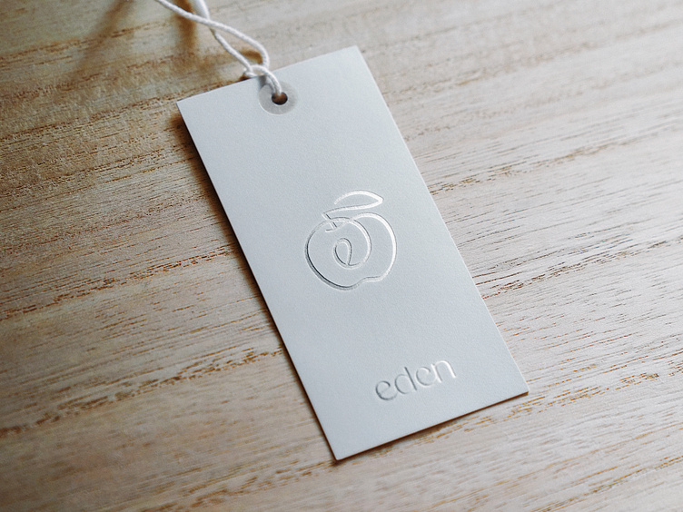
Eden's mark blends the likeness of an apple with a lowercase monogram while suggesting a happy mouth and smacking lips.
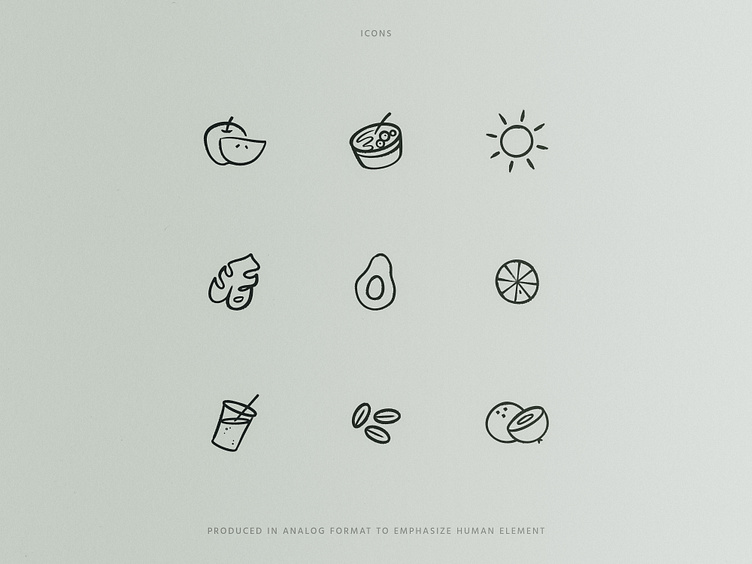
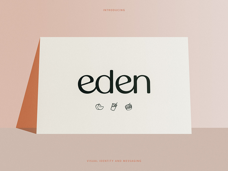
Icons
Eden's hand-drawn icon set can repeat as shown for use as an ambient brand element. Icons may also be used individually to denote info in the context of badges, web navigation, and so on.
We produced each icon by hand using Procreate to mirror Eden's commitment to real ingredients, prepared by human hands, etc.

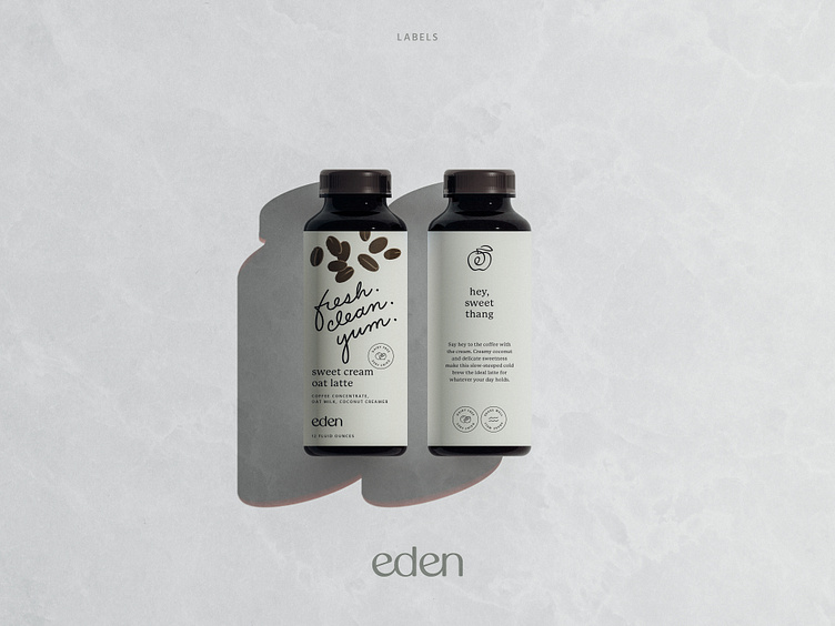
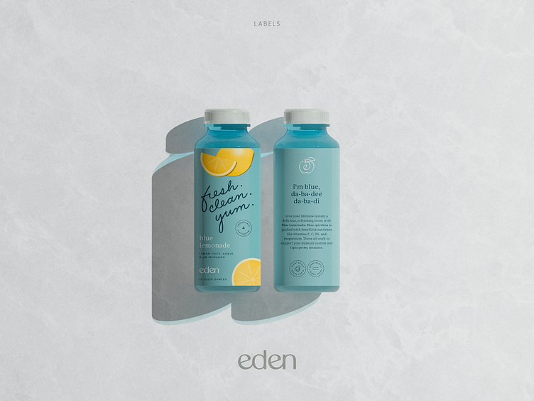
Package Design
Eden's package design emphasizes romance copy and places brand language at the forefront. Fresh. Clean. Yum. — a quip that sums them up in a memorable, approachable way.
We opted for an organic, hand-drawn treatment to reinforce the message.