UI/UX Starbucks Case Study

Design Softwares used: Adobe XD
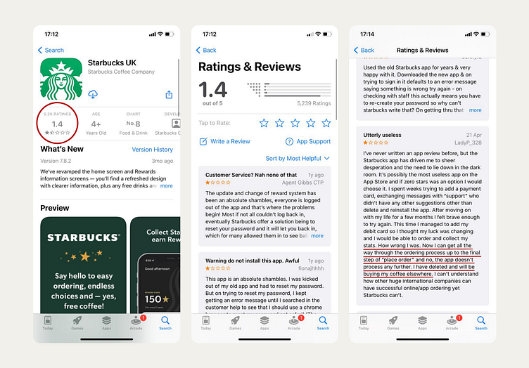
As the world’s largest coffee chain, Starbucks boasts a massive revenue of $29.06 billion, yet their app holds a low rating of just 1.4 stars. Many users report frustrating issues, including trouble with logging in, difficulty customising drinks, and challenges placing orders. To address these pain points, I took on the task of redesigning the Starbucks app, focusing on improving the user experience and solving critical functionality issues.
Branding & Design Trends
While my primary goal was to resolve functionality issues, I also saw an opportunity to refresh the app’s design. I kept the brand's iconic colours but introduced modern design elements to align the app with current trends. These enhancements included:
- Personalised welcome messages to create a more engaging experience.
- Playful animations that enhance the user experience without being distracting.
- A minimalist interface with bold typography to improve readability and usability.
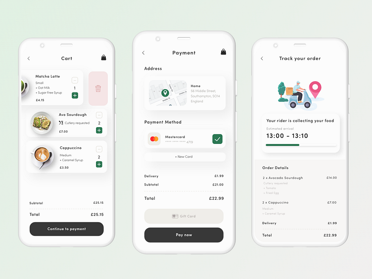
Issue 1: Difficulty Customising Drinks
Customisation is essential, especially with the rising demand for dairy-free alternatives. According to Alpro, 48% of coffee drinkers now request non-dairy milk, such as almond, soy, or coconut. However, Starbucks customers frequently complain about difficulties in customising their drinks within the app.
To address this, I redesigned the drink customisation process to make it more intuitive. Users can easily add dairy-free options, syrups, and toppings, while also specifying allergies. This not only makes the app more user-friendly but also ensures that Starbucks is keeping pace with customer trends and dietary preferences.
Issue 2: Inability to Place/Process Orders
Another major complaint centered around the inability to place orders successfully. Users reported issues at the final stage, leading to abandoned purchases and lost customers. As one review stated:
"I can get all the way through to 'place order,' and the app doesn’t process any further. I have deleted and will be buying my coffee elsewhere."
To solve this, I redesigned the order placement process, simplifying the user flow and adopting a minimalist interface to eliminate confusion. Taking inspiration from highly rated apps like Deliveroo, I incorporated fun animations and clear, actionable prompts that guide users through the checkout seamlessly. This combination of engaging design and smooth functionality is key to restoring customer confidence in the app.
Conclusion
Through this redesign, I focused on solving Starbucks’ key app issues by enhancing drink customisation and streamlining the order process. By integrating modern design trends and user-friendly features, I’m confident these changes would not only improve functionality but also lead to better app store ratings.
