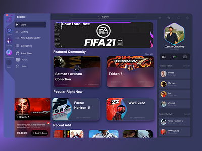
Steam Redesign
Have you ever imagined what the Steam game store would look like if it was created in 2022? We did, which is why we attempted this Steam Redesign Case Study.
Steam remains one of the largest gaming platforms, and it has enormous business potential. However, its user experience remains in the 2000s. I conducted some research and brainstorming on potential solutions, and this was the beginning of our concept redesign project. We created it for gamers.
In an earlier post, I recreated the infamous Steam Desktop in Figma. You can check that out for more insight.
Today, I present…
Steam Redesign!
So I took some heavy inspiration from “Web App UI Design – Figma”. Rather, I took it as a base. The UI attracted me in a way because it looks fantastic, and follows modern three-pane design trends. The design itself doesn’t look captivating but instead, it gives a minimalistic look to a user or any designer, giving them a “blank canvas” to use that interface or play on that platform.
I started building the UI. I preferred it to be a little the same as the original one had a sidebar panel which made it look different and the main panel of the store was also amazingly made. So I kept many things the same but did some improvisation as per my point of view.
My favourite part is that the Friends are now clearly visible, so you can now enjoy gaming with them :)
UX feats.
Three-pane (easier access)
“Currently Playing” bar - Similar to Spotify
Quick access to Friends and chats
Want to work with us?
We build super cool stuff all the time. So why not yours?
UI/UX
Web and Mobile Development
Startup MVP Development
Meta (Blockchain, AR/VR)
Find us!
📩 Email: grayhatdevelopers@gmail.com
🏀 Dribbble: https://dribbble.com/grayhatpk
🤩 Behance: grayhatpk
Recreated by Zeerak Chaudhry
