Absorb Website Optimizations
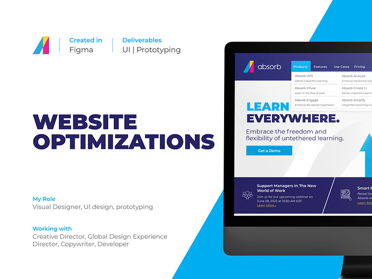
Background
Absorb Software is dedicated to empower people and organizations to excel through learning. Absorb is a cloud-based learning management system (LMS) engineered to inspire learning and fuel business productivity. The online learning platform combines forward-thinking technology built to scale as organizations grow, with superb customer service in the LMS space.
The Brief
How to improve the user experience on our current website?
As part of our efforts to drive more traffic to our website and improve the experience to engage users, our Director of Global Experience & Design proposed to look into some aspects that could enhance our website in addition to future-proof it.
Working together with the creative director, our goal was to research best practices and propose improvements to our website that would make it more accessible and intuitive.
My main constraints on this project were:
Making sure how we use our colors is WCAG compliant.
The changes shouldn’t affect the current layout too much.
Research
Based on the main goal of the campaign, the main changes would focus around:
Buttons colors and contrast as well as their visibility on mobile devices
Improvements to the top navigation
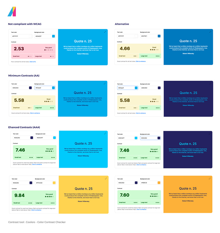
With this in mind, I decided to do some research on how our colors fair on accessibility and what would be the best combination to make sure everyone could interact with our website effortlessly. I created a comparison chart based on the results on Coolors to have as a reference to which color pairings have AAA or AA contrast and should be used in the website.
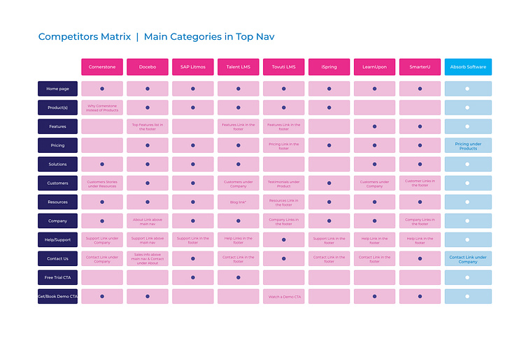
Then, I conducted a competitor's analysis to see how to improve the top navigation and provide the right links for the users to gather the data they needed to make an informed decision. When looking for a new LMS, learning about its features and the solutions it offers is crucial as it sets the excitement and expectation about the product. But another important part in the decision making of requesting a demo is the pricing. Adding the pricing page to our top navigation would help the prospects/users find the right information in a quick and easy way instead of hunting for the data in the different items of the navigation.
Solution Ideation
Wireframes
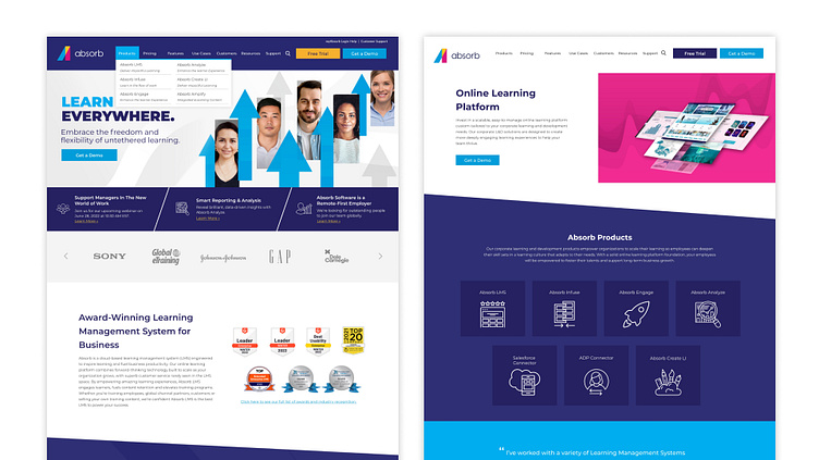
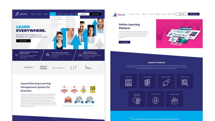
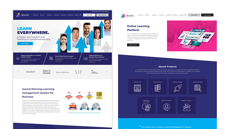
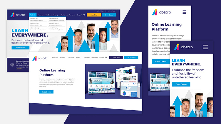
After my initial research, I started wireframing some options in Figma to explore the order of the links in the top navigation as well as how to improve the buttons colors.
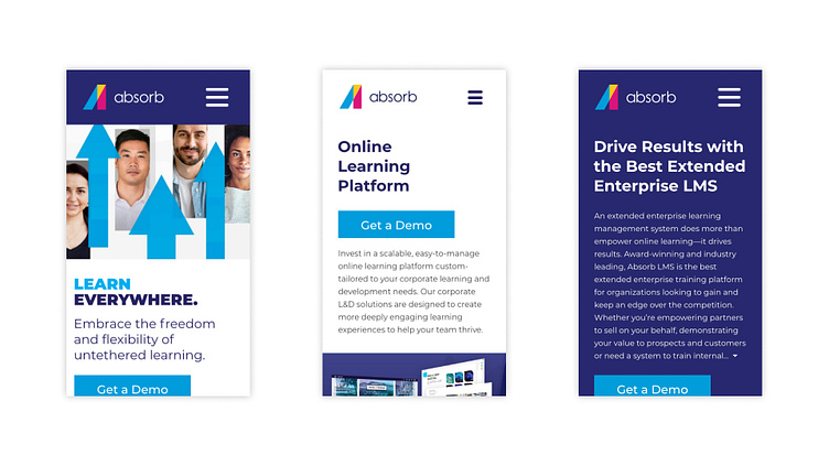
Aiming for AAA contrast, I tested some possible colors we could use on our website to attract the eye to the important call to actions without disrupting the flow of the layout. For the top navigation changes, I focused on the position of the pricing link and where it would make the most sense for the user to check this page once they have a better idea of our product.
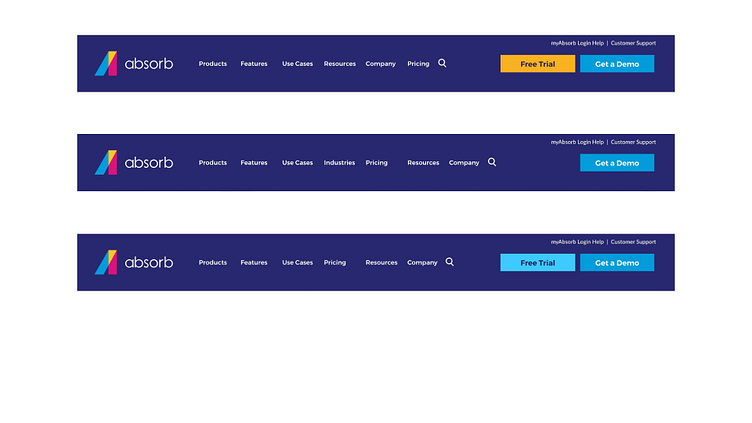
To keep top navigation clean and simple, I removed the customers and support links to make space for the new one. Most of the links under those 2 tabs were already part of the footer, and are not very relevant at this point of the customer journey. At this stage, the most important part is to provide as much information as possible as to why Absorb LMS is the best solution for their organizations.
On the mobile side, I focused on making sure the call to action was visible above the fold by rearranging the top elements without losing the most important information.
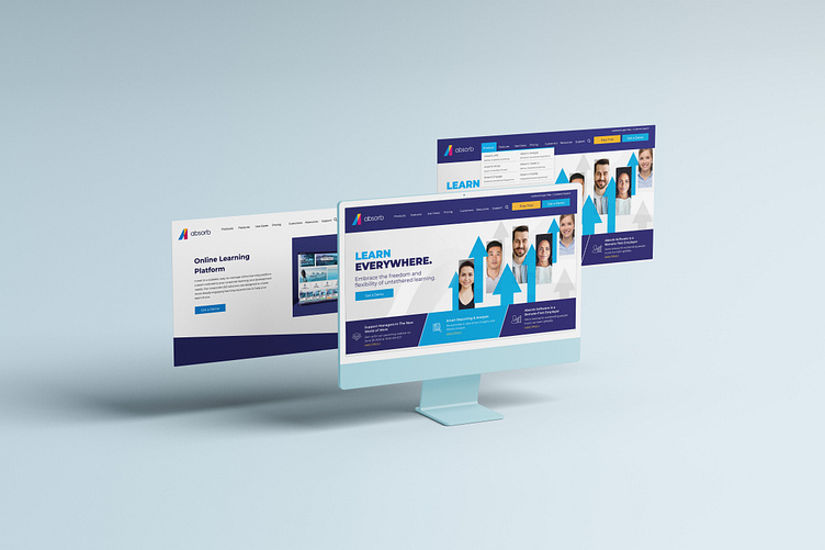
Prototyping + Test
Small changes with big impact
Based on feedback provided by the Global Experience & Design director, we decided to move forward with a set of colors for the buttons that will work on light and dark backgrounds to ensure they are compliant with accessibility standards.
For the top nav and mobile changes, we decided to A/B test the position of the elements to see which of the changes would increase engagement and conversion. Using VWO, we tested 3 different positions for the pricing link on the top navigation for a month, anduse casessolutions. By adding the link after Use Cases, the users have already checked our products and the LMS features, got an idea on how to use their LMS to empower their organization and would want to know more about the pricing model Absorb has.
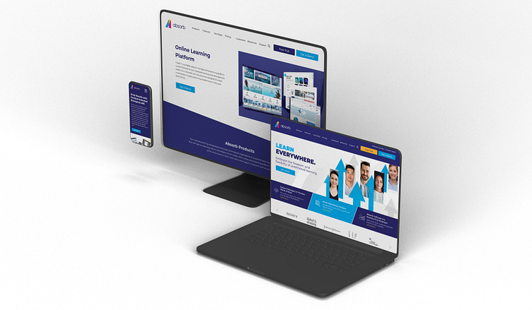
Check the updates live on Absorb LMS website.
Lessons Learned
Working in a constricted setting was an interesting experience, it forced me to focus on the things I could change while at the same time I noticed more things that we could improve in the next phase. Being able to A/B test some of the positions for the Pricing link was very valuable as it helped us see how the users interact with our website, and being able to see and request the pricing model after their first research of the product definitely has some impact for conversion (requesting a demo).
Next steps on this project would be to A/B test the approved mobile changes before applying them permanently to our site to make sure the user is interacting with the right information and this would help us corroborate our design assumptions. It would also be a good idea to improve our footer layout while making sure all the links for the different sections on our website are provided ensuring anyone visiting our site has access to all the features and information Absorb LMS has to offer.
