IO - Documents Redesign
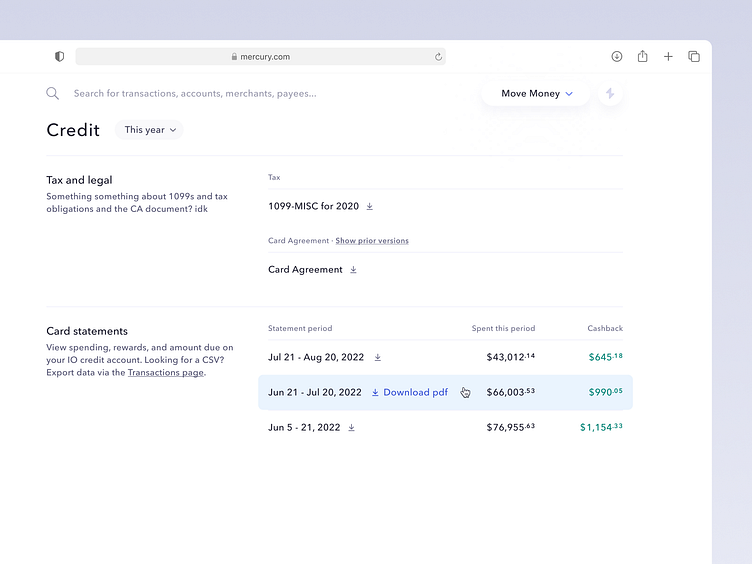
With the addition of credit, we needed to expand our documents page design to be more inclusive of things other than statements. Previously we'd adopted a tabbed approach, but with files organized by year anyways, there wasn't much of a need.
This update shifted to described sections, with non-statements up at the top. For checking accounts, this means easier access for things like bank letters and wire details, but it also gave us room to include helpful links (like "go to the transactions page if you're trying to get a tabular version of this data").
Projects like this are a great place to revisit old patterns as well—we could have simply added a credit docs page and been done with it, but taking a few extra beats to evaluate if old UI is still effective can create great opportunities to pay down small amounts of design debt before it collects.

