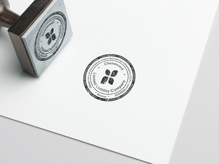
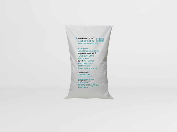
Cheminvest Logo ver. 03


Third concept of the logo for agricultural trading company. The logo uses two literal images referring to the final product — sprout leaves and ears of wheat — to form the first letter of the company’s name. The signmark combines plasticity referring to natural forms and a strict ordered structure.