Get Profit Landing and Branding
Traffic platform where a partner attracts new traders using various advertising tools and receiving payments in chosen model.
Research and user interviews
Get to know our users and understand their needs before figma
Branding
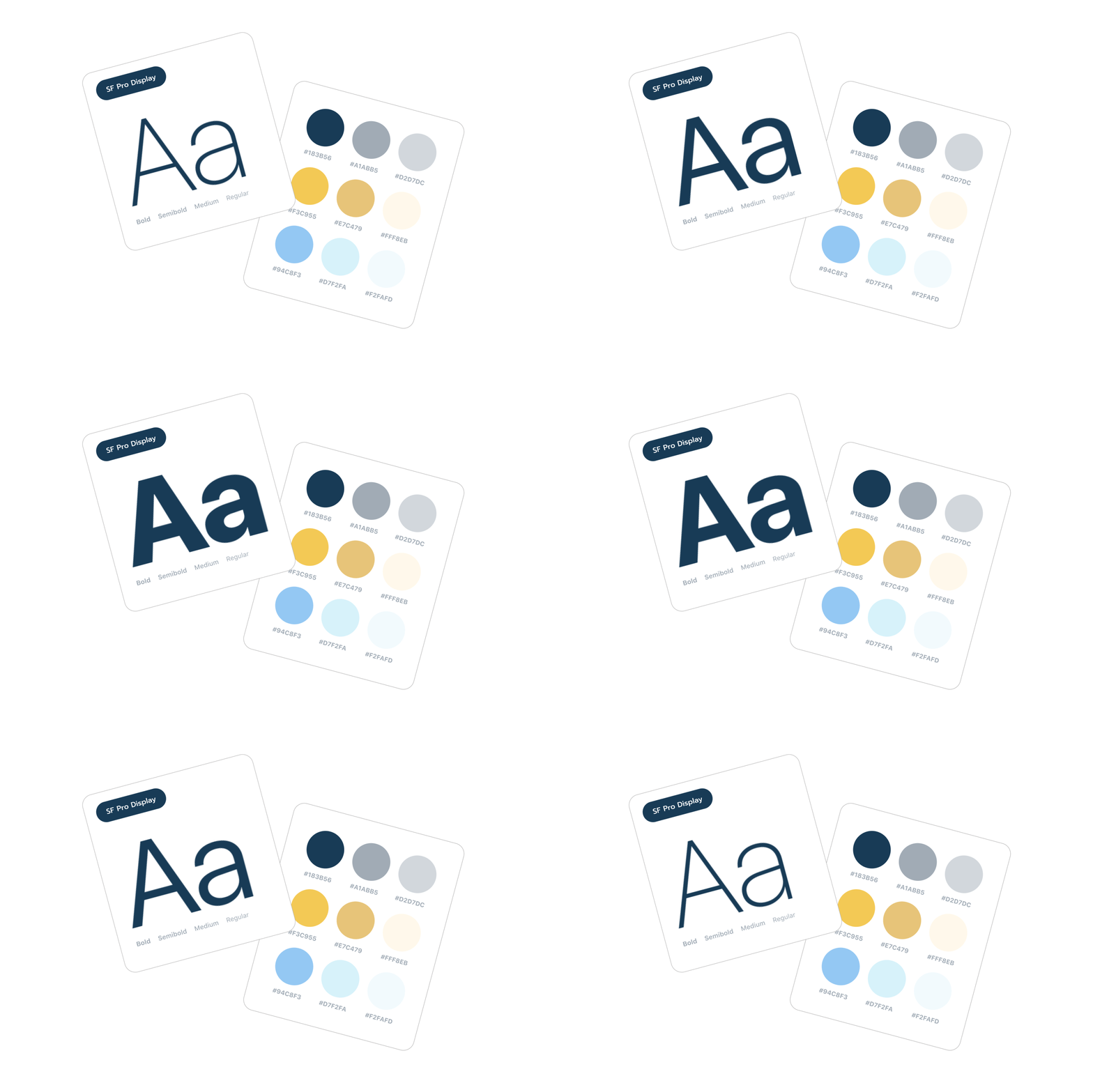
Think over a new visual that would meet all modern requirements. Neutral light colors were chosen, combined with white and black.
Final results
We get convenient tool for attracting potential partners. Having solved the problems of the previous version of the site, managed to increase the conversion rate.
More by Andy ZIko View profile
Like


