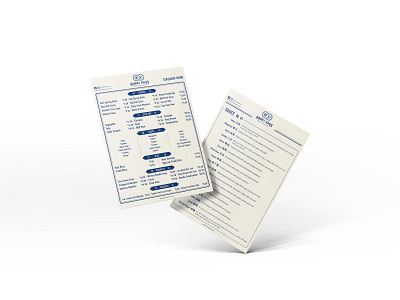
Visual Identity - Honki Haus
The idea of logo comes from a design element commonly found on vintage menu of HK style restaurant "Cha Chan Teng". On menu, HK signature design elements are used here, eg. wrapped arc font, double circle shape...etc. navy is used here to create a vintage old Hong Kong style.
Honki Haus is a modern Chinese restaurant located in Australia, specialising in Cantonese cuisine. Their origins are from Hong Kong, and would like to present that feel back to their customers.
More by Cassandra Chan View profile
Like
