Ample Design System | Checkbox
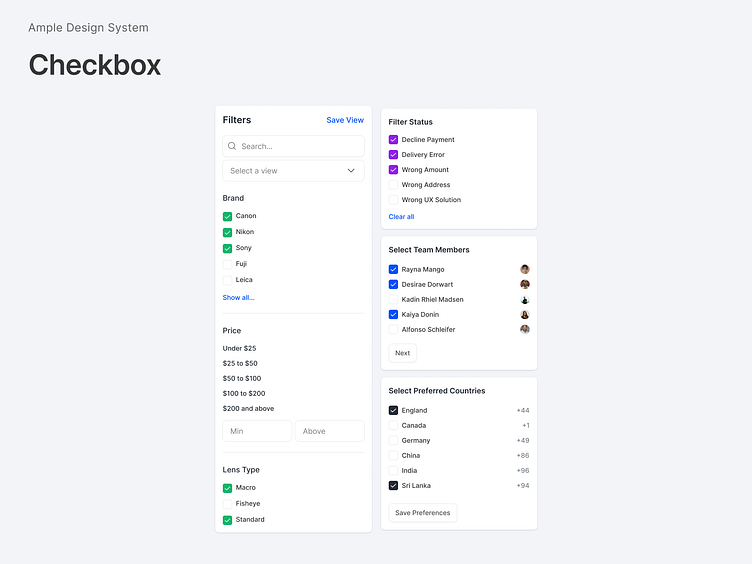
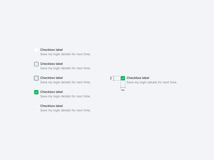
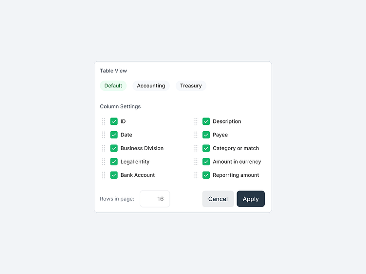
Checkboxes allow users to select one or more items from a set. Checkboxes can turn an option on or off.
Unselected: A state indicating that a checkbox has not yet been selected, or has been deselected. While there is no default state for checkboxes, they will initially appear unselected in most situations.
Selected: A state indicating that a checkbox has been established prior to or upon user interaction.
Dirty Indication: In certain instances, a dirty state is used to indicate that the status of a checkbox has been changed either by the user or by a third party. This would appear when the checkbox has been selected prior to or upon user interaction if applicable.
Disabled unselected: A state indicating that the checkbox is unselected and cannot be changed due to other factors. Since the conditions that necessitate a disabled checkbox are often unclear, it's best to pair this state with a Tooltip explanation that describes why the option has been disabled.
Disabled selected: A state indicating that the checkbox is selected and cannot be changed due to other factors. Since the conditions that necessitate a disabled checkbox are often unclear, it's best to pair this state with a Tooltip explanation that describes why the option has been disabled.
Ample - The SaaS design system
Ample is a design system created by Amplifyn, to help build consistent interfaces that are user-friendly. It bundles design tokens, design patterns, front-end code, and guidelines as a foundation that is not overly complicated. Ample provides just the right amount of building blocks to craft a better user experience in SaaS products fast.
Want to know more? https://www.amplifyn.com/