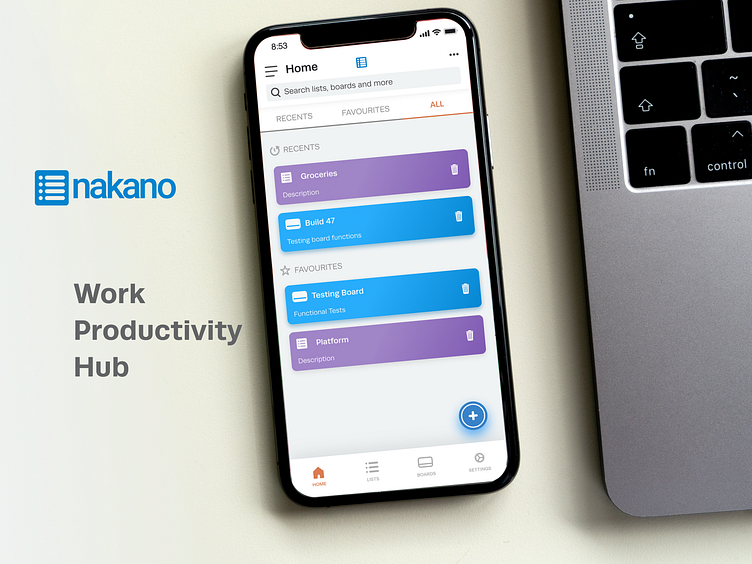
Nakano Productivity App - UI Design
Overview
Nakano is a work management solution meant to help individuals and businesses track the progress of their activities, workloads, and projects. I was contracted to design the screens on the existing prototype.
My role
User Interface Designer
Team of 6, a project manager, developers, and a marketing manager
Responsibilities
UI design and visual design
Timeline
This project took place over 2 months in October, 2021
THE PROBLEM
How might we make a singular work management app, one central hub for all productivity apps.
There are many work productivity apps; the ability to link all the apps and organize all of their tasks and schedules in one central hub would make this app unique and extremely valuable.
THE GOAL
To be a singular location for all of your various productivity apps (slack, github, etc).
For an end-user, the work management app will help them be more productive and organized in their day to day life.
DEFINING THE USER
Persona
After gaining clarity on the initial project I brought the team up to speed about the importance of having a persona. I created one that we all agreed captured the end-user well.
THE EXPERIENCE
Wireframes
The team had already developed wireframes and tested numerous prototypes.
IDEATE
Concepts
After learning about the user and business requirements, I generated ideas freely and quickly.
INTERFACE DESIGN
Onboarding
I presented the first round of the onboarding screens to establish the visual identity and showcase how it follows the project goals.
INTERFACE DESIGN
First version
Once the visual identity of the app was established, the first version of the required screens were created.
INTERFACE DESIGN
First iteration
In order to make it easier for the user to acheive some functions, changes were necessary for some screens.
INTERFACE DESIGN
Second iteration
In this version, categories had to be distinguished, and further lists and boards were developed.
INTERFACE DESIGN
Finals
Final screens sent to developers.


