walk&bark: your dog's new walking buddy

No more flipping through newspaper ads or scrolling through social media posts – walk&bark is your one-stop shop to finding your next trustworthy dog walker!
Scope of Project
We treat our beloved pets like family, which means we do not accept anything but the best when it comes to their care. How can we alleviate this concern in our mobile application without distorting essential design principles? For this project, the challenge was to design a user-friendly mobile application to foster trust between dog owners and dog walkers. Striving to deliver a scintillating application, I conducted thorough user interviews, iterated upon countless design layouts, and streamlined the user flow of walk&bark over the course of several months.
Research
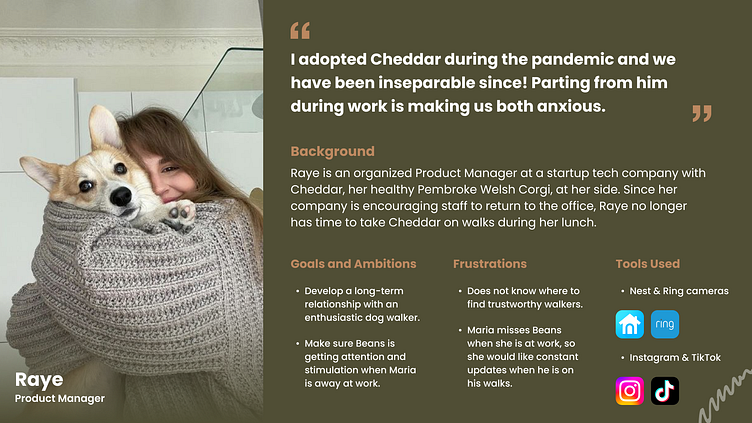
The first step in any design process is to gain further insight into prevalent pain points that ails dog owners. To do so, I interviewed two dog owners and two pet sitters. I made sure that the interviewees had varying experiences with dog walking apps, ranging from those were fluent in navigating that space to others who had never heard of such services. After analyzing the data I gathered, I then identified key components to incorporate into my user persona.
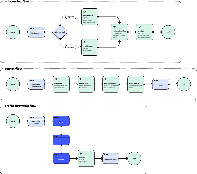
User Flows
Understanding both perspectives helped me prioritize what features would be instrumental in achieving the goals set out for this project. Following this reasoning, I decided to design an application that was dual-facing: one for dog owners and one for dog walkers. I have mapped out their pathing in the user flows below:
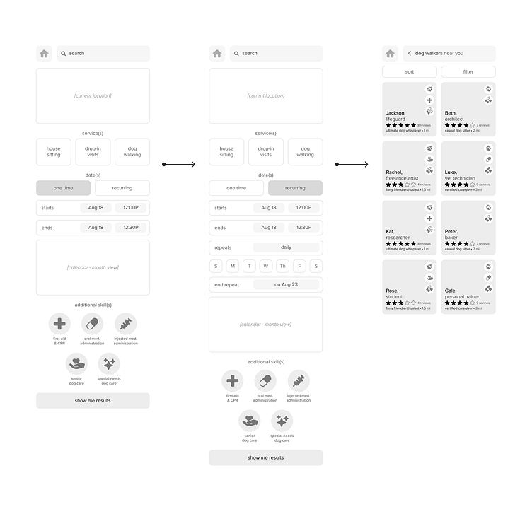
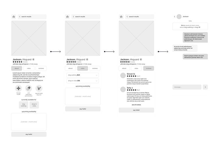
Wireframes
Now that I’ve identified the different screens walk&bark would need, the next step is to visualize the overall look of the application. It was imperative that the interface be as straightforward as the service. You can see the iteration process here:

Visual Design
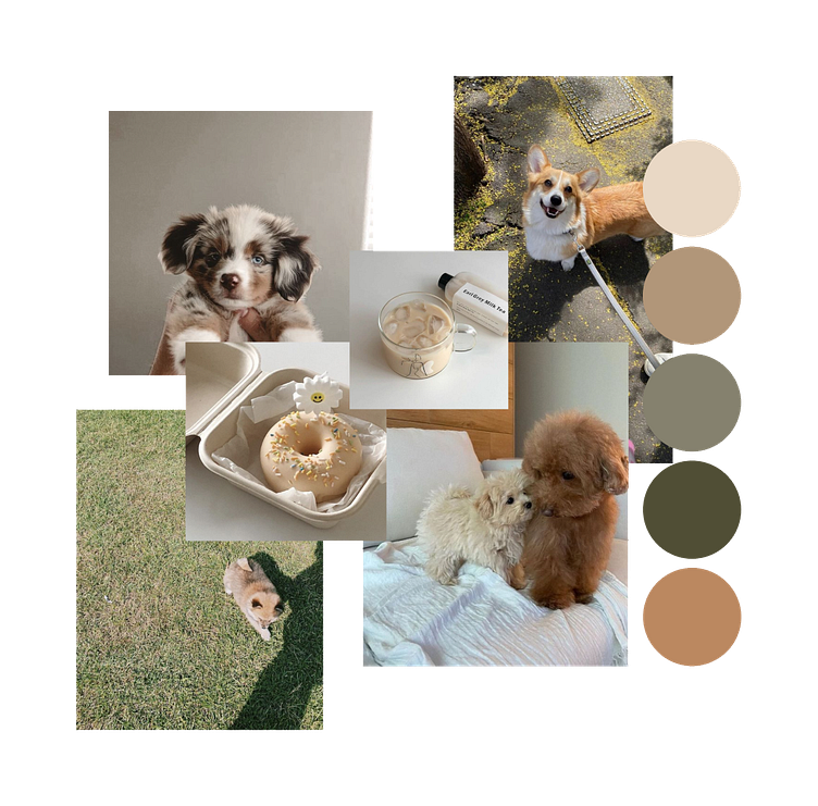
Next, I put together a mood board of elements that promote feelings of coziness, safety, and trust:
This eventually evolved into the following design breakdown:

Prototyping & Demo
Final Thoughts
This was an excellent opportunity to stretch my creative muscles! I was excited to explore simple, clean user interfaces that integrates the traditional design principles that are standardized across our more well-visited mobile applications. I’ve outlined some of my thoughts below:
Research, Research, Research!
You can never know too much about your user – the more fleshed out the user persona, the easier it is to design for them. When you first begin designing, everything is still rather conceptual, so visualizing a more grounded scenario makes approaching the project so much easier.
Consider Different Perspectives
I found myself often going down design rabbit holes and trying new design layouts. While it’s great to diversify your design arsenal, your target audience may not have a design eye. Making the interfaces too complex can alienate your user, which ultimately defeats the purpose of product design.
Only Three Iterations? You Must Be New Here.
Designing critically often means encountering more problems before you can solve them. Iterating countlessly helps anticipate some of the smaller fires that may pop up in the long run. Product design requires the flexibility to experiment – while it’s safer to adhere to the first idea that comes to mind, it is more fruitful to shape it into something groundbreaking.