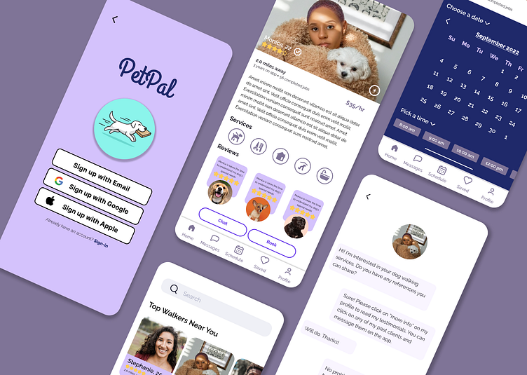
PetPal - Dog Walking App
The goal of this project is to create a new dog walking app that fills a gap in the market. This project aims to create an app that develops trust between dog owners and those providing dog services.
It's all about TRUST
Dog owners sometimes need help caring for and walking their dogs. However, dog owners are weary of leaving their dogs with someone they don’t know. Dog owners want to feel comfortable and trust that a member of their family is in safe hands and being cared for properly.
Scope and Constraints
Over the course of 7 weeks, we were tasked with developing a dog walking app that addresses the problem of trust among dog owners.
Constraint #1: Short Timeline
We were given 7 weeks to complete a product design from research through prototyping. Because of this short timeline, there's not as much for iterations, and fine-tuning the product.
Constraint #2: Limited Research
Similar to the time constraint, the scope and extent of the research prior to developing the product were limited. Research on the needs of the user was limited to close friends due to the short timeline, bandwidth, and resources.
Defining the Users
I interviewed a close friend that is a dog owner to get insight into what dog owners are looking for in a dog walking app. Based on the research interview I conducted, I created a user persona that represents my key audience when developing the app’s workflow, UI, and visual design.
User Flow
After conducting market research and qualitative interviews, I went through a couple of iterations of a user workflow for app onboarding, sign-in/sign-up, and finding a dog walker. My focus was to simplify the sign-up/sign-in process compared to other apps on the market.
Instead of having the user complete their profile/dog profile during sign-in, I made it an option for them to do this after signing up/setting a password. I’m keeping in mind the busy user who wants to jump straight into the account and explore the services and/or dog walkers available in their area.
Wireframes
Once the user flow was completed, I drafted low-resolution and high def wireframes for the sign-up flow and the walker search flow. Two iterations on the wireframes were created with the intent of finding different ways to meet the needs of your user making the flow as simple as possible. Click here to view wireframes
In future versions of the wireframe, I added a few more details about the walkers' services and the option to click through to read more about their background and credentials.
Prototyping and Design Refinement
A prototype of the workflow in action was tested using the Figma Prototype feature. I tested the prototype and made changes to the workflow to make it easier for the user to navigate. View prototype here


