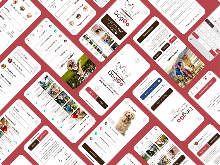
Dog Walking App Case Study: DogGo
Step 1: Problem Statement & Research
Find ways to gain insight from dog owners, to understand what their pain points are, what support they wish they had, whether an app could provide easy access to a dog walking service and finally, get them to share experiences of using a similar app that is currently on the market.
I shared a Google Form survey on a local community WhatsApp Group and found that:
1. Safety and Trust is the number priority for most Dog Owners. They want to know their pet is safe and that they can trust the service provider with their pet, within their home environment and out on a walk.
2. Most feedback indicated that the majority of Dog Owners relied on references or a form of verifying that the Dog Walker is experienced, trained and trustworthy.
3. Finally, access to information, ease of use and simple administration to manage a booking is essential.
Step 2: User Personas
With the additional support of User Persona's the concept of a Dog Walking App facilitating and managing a Dog Walking App was taking shape. User Personas help the development team to empathise with the customer and define pain points and solutions better.
Step 3: User Flow
Based on qualitative and quantitative research, a User Flow is created to start understanding and defining a journey. This introduces the first iteration of how a potential user would navigate the app. By keeping it simple, the user flow can be understood, refined and used as the blueprint for the next step in the process.
Step Four: Low Fidelity Wireframes
With the blueprint - user flow as the blueprint, the product designer starts creating a low fidelity wireframe. As with the User Flow, this iteration in the product design process, should provides an additional layer to the design and decision making process. Keeping the wireframes simple and in grey-scale, ensures the stakeholders are focusing on the functionality of the app, rather than the end product. Before moving into any high fidelity version, the functionality and user experienced should be well understood, make sense and refined enough to start moving to the next step. Visual Design - the 'Bling Version'.
Step 5: Style Guide & Visual Components
This is where the fun started. Bringing the ideas to life with colour, images and text. I found that as I progressed through the various steps, my ideas changed. My mentor guided and suggested changes and prompted me to think about my decisions, layout and possible caveats. I have kept my case study raw, so that any person viewing this case study can see how the concept evolves throughout the design process. As a Product Owner, I now see how essential collaboration between stakeholders and the development team is and how delicate the balance is between what to and what not to share at every given juncture.
Step 6: High Fidelity Prototype
With colour, graphics text and fonts added, I was able to proceed in creating a prototype within Figma. Once again, I was able to take the working prototype with some functionality, back to the potential users and test.
Was it a success? Some thought it was a Dog Show, others were amazed at the new skills I acquired over the past 12 weeks.
What I have learnt? I need to practice, practice, practice!!!!!!!!!!
Final word!
What I have taken away from this course is:
1. How invaluable product design is in the development of any solution.
2. How vital collaboration between stakeholders, developers and the product owner is.
3. Test, test, test and test again.
Thank you for taking the time to view my case study and please pop in again, to see how my journey as product designer evolves.


