The Turnpike Gallery: a rebrand for all the community

rebrand//logodesign//print//social//e-template
The Turnpike Gallery.
We got talking to The Turnpike Gallery when the former CIC was absorbed into the loving arms of Wigan Council and they needed a rebrand that straddles the corporate and art worlds.
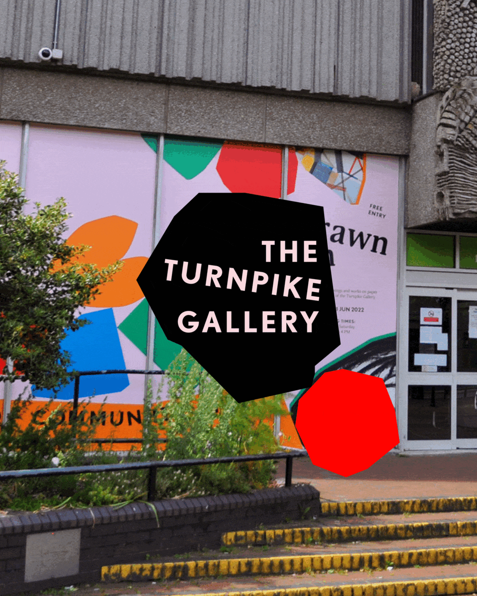
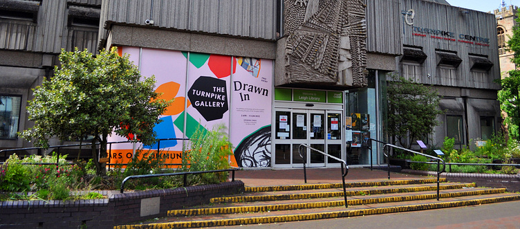
The main criteria was to make something inclusive, accessible, and representative of the diverse communities in Wigan and Leigh. Another aim for this rebrand was getting people into the gallery, when there’s a history of disengagement and an abhorrence of the word ‘culture’. With the gallery situated in the brutalist Turnpike Centre, next to the library and job centre, this is no small ask.
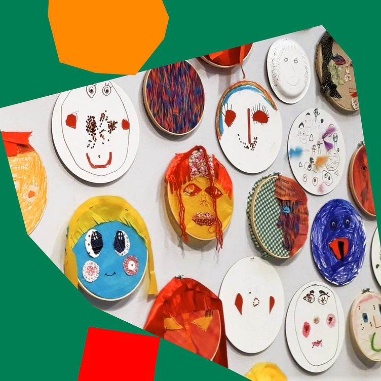
And, sorry, HOW cute is the branding all blown up and immortalised in their window vinyls?!

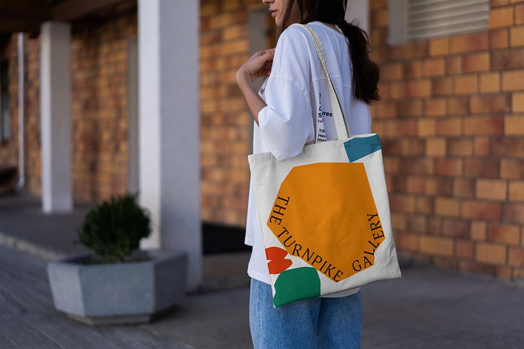
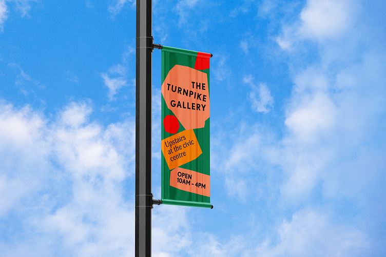
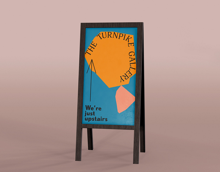
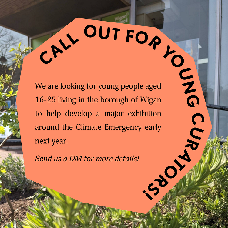
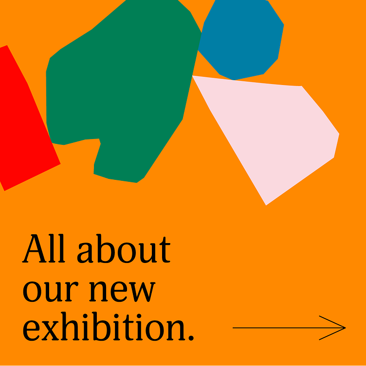
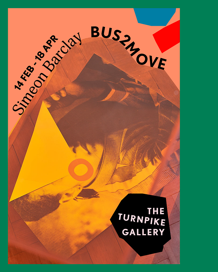
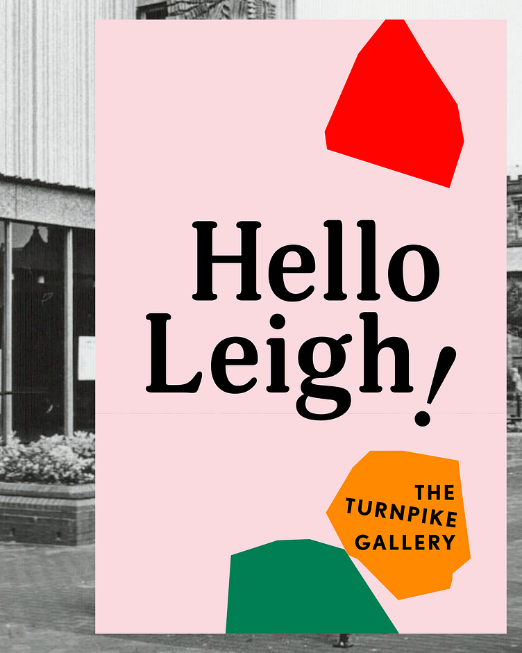
All shapes & sizes.
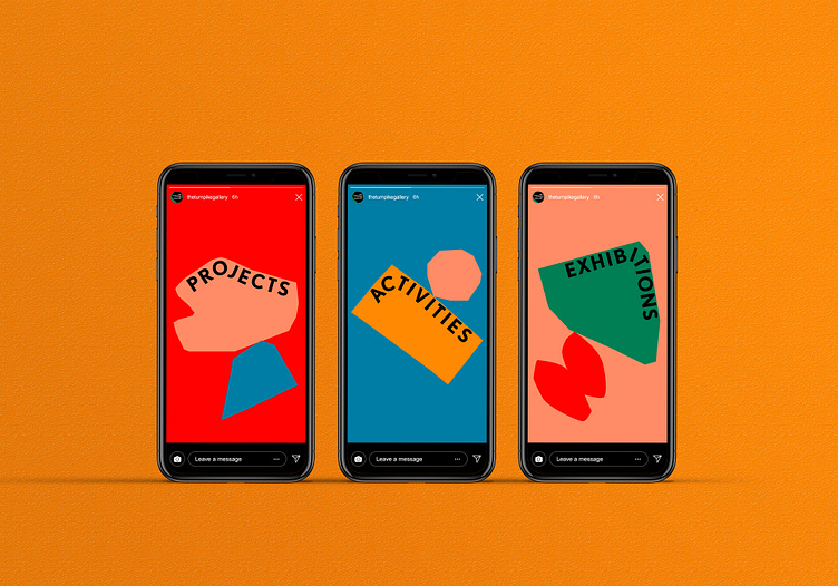
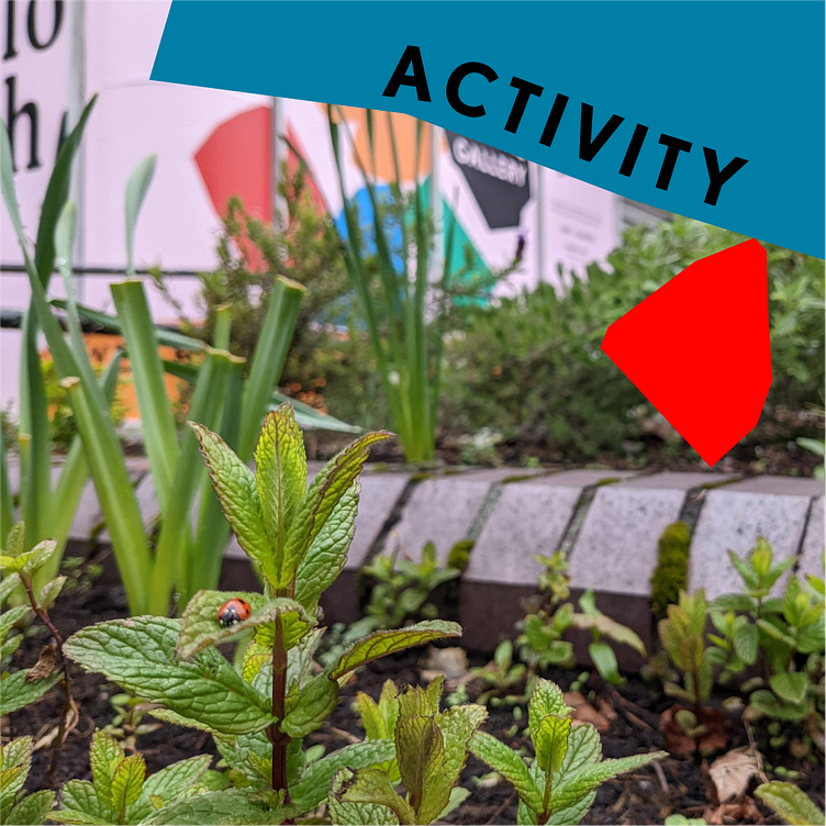
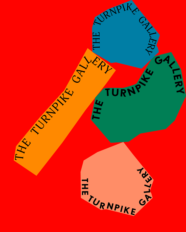
In the spirit of community, we came up with a core brand concept that’s based on shapes that stack and support each other to frame upcoming exhibitions and add some fun to the TPG’s printed and digital collateral. They are colourful, irregular and organic - reflecting the different communities in Leigh and Wigan coming together.
Playful writing arrangement to frame content as well as your standard signature logo. A modern font-mix means anything goes!
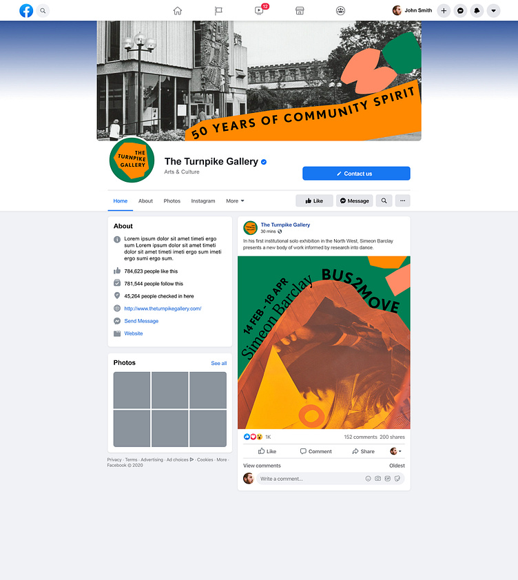
We got your totes, we got your socials, we got your e-vites, posters, and allllll the flags you could ever want. Now go forth and visit The Turnpike Gallery!