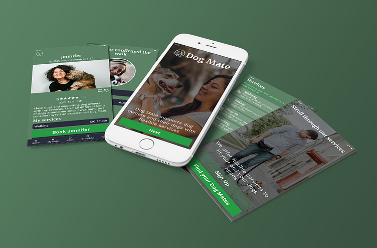
Dog Mate
Problem Statement (Pitch)
I am 40, freelancer, have a 1 year old 30kg dog and have to travel sometimes. And - I can tell you- it’s hard to find a dog sitter for my boy. So I needed to act and created my own solution to find our Dog Mate. A get together platform for dog owners and dog sitters with the focus on trustworthiness.
Discovery & Ideation
In a group we:
Discussed the problem
Discussed the different users we might have
Discussed the risk and reward of solving the problem
Created ideas and validated them
Defined project goals for the business, for dog owners and for dog sitters
Research & Empathize
To understand fellow dog owners very well I interviewed them. It proved what we found out in our group discussion. The main paint points and concerns of dog owners are:
Based on that I defined my user persona:
User Flow
With the informations about the users and their pain points I was ready to create the user flow for onboarding, searching a dog sitter, exchanging messages with possible sitters and booking a service.
I focused on gaining trust of the users as I let them go through the whole service of my „Dog Mate“-App without signing up. Only when they want to interact with dog sitters they are asked to create an account.
Wireframes
After I tested the user flow I started to layout and structure the defined screens. I tried out different elements and compositions till I liked the usability.
Visual Design
To put a proper prototype together and offer the wanted look & feel to test users I created a mood board with my:
Color palette
Typography
Illustrations, Graphics and Images
I also created the „Dog Mate“ brand for the business. I liked „Dog Mate“ as the name of my service to represent the connection between dog owners, their dog and the sitter that should become a friend for a long-term relationship. I wanted the app to feel like a honest, trustworthy service.I chose earthy colors as it might fit the main audience - and the topic - best. I replaced illustrations I planned before with high quality images showing happy dogs with people to represent what the goal of my service is. For the typography I chose one more elegant font for headlines and a clearly, structured font for informational texts.
Components
To have a consistent look & feel throughout the app I designed components and organized them in a component library. I fell in love with Auto Layout from figma to have well organized and stable components and layouts. This way it is easy to rearrange elements in the screens and iterate ideas.
Prototyping & Testing
I enjoyed very much bringing static screens to life. To add all the interactive elements and navigate through the screens with animations was huge fun.After watching my test users using my first prototypes I needed to change:
My color palette as my first choice didn’t represent the honesty and the professionalism it should
The search form. It was experienced as too bloated so I changed it to a multi-step-process.


