Dusk Network - Redesign Concept
One of my next redesigns inside the crypto space. To iterate on the landing page of Dusk Network, its structure and a new brand language. Trying to optimize their onboarding with a semi-retro approach, while keeping it business-oriented.
Giving H1’s and H2’s a distinct size difference helps headline hierarchy and structure. On the current Dusk website there’s little optical difference between headlines, which makes it hard to scan and scroll through the content at a controlled pace.
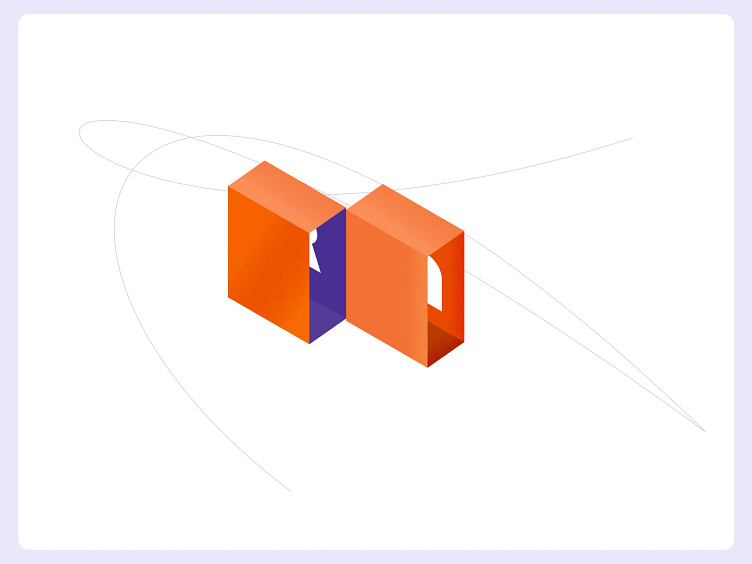
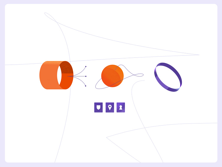
I'm in love with (semi)-retro materials and illustrations. So I created some custom elements that accompany the content. To improve/replace Dusks current open source/memphis-like stock graphics.
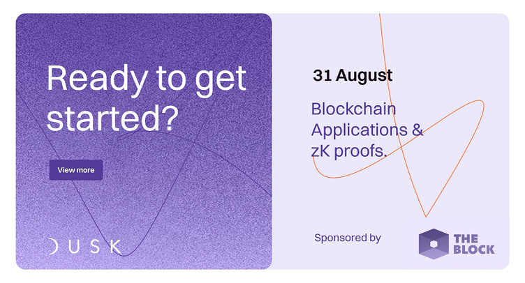
Gradients, noise and lines are used to spruce up otherwise plain social media templates.
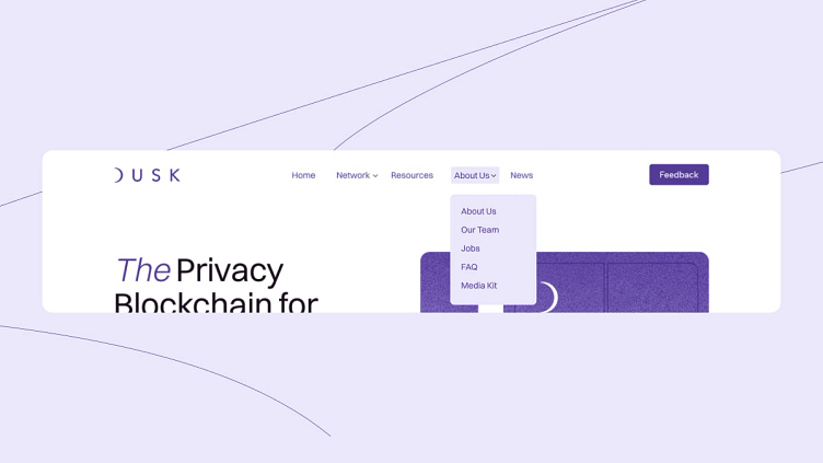
The navigation is restructured by using a call to action for the feedback and housing two single links into content-related dropdowns. It allows breathing space and increases legibility on tablet breakpoints without having to reduce text sizes to 12px, like on the current site
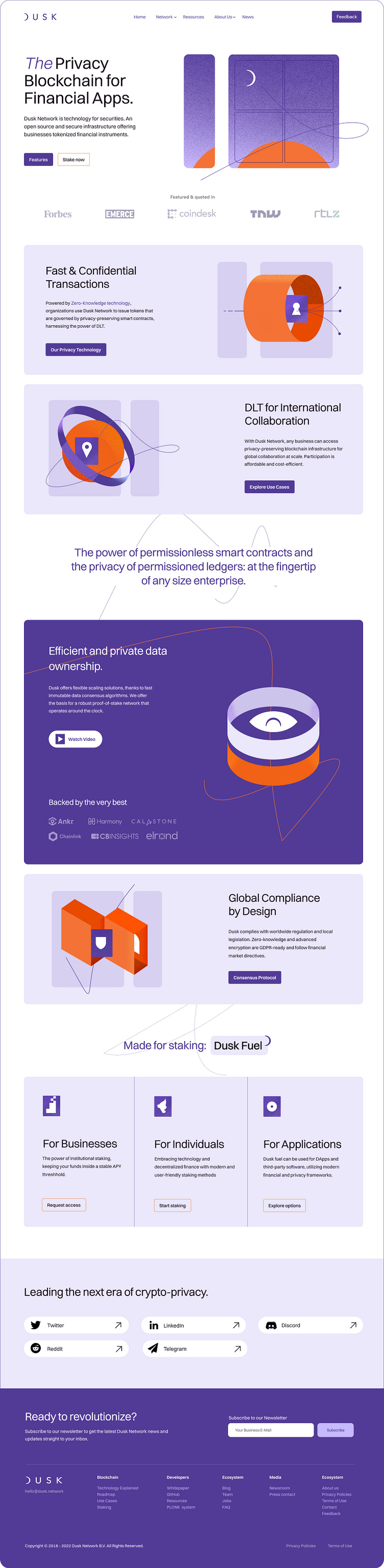
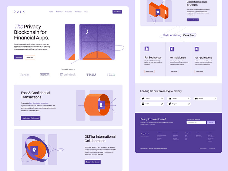
Full page preview