Cleo - Pet Store Caring App

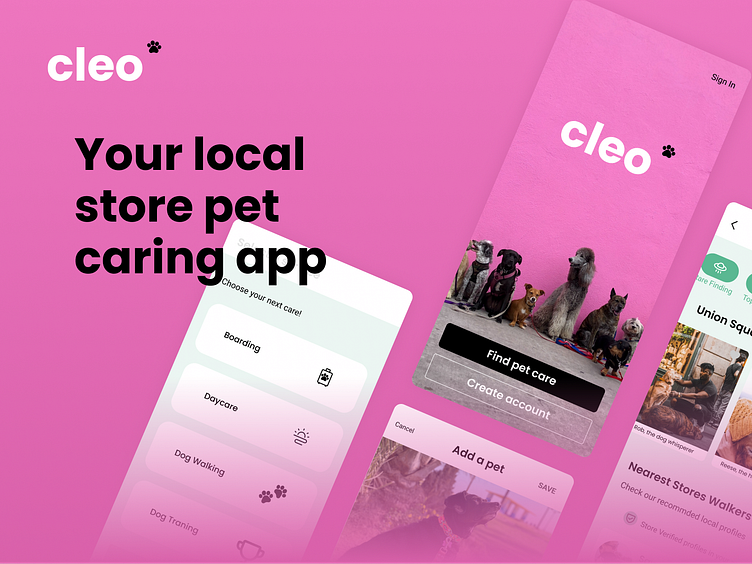
You already know your pet's Vet and hairdresser. Now it's time to meet your local pet shop carer for your pet. Access the services your trustworthy Pet Shops offer in Cleo APP.
Hi there! I'm Paula, and this is my dog walking app :)
It's been designed and thought for Dribbble's Product Design Course. I have ZERO design background, and I'm actually the COO of a mobile solutions company. So you can imagine, it’s been a journey full of challenges! One of my weaknesses is that I see business in every single idea, so I struggled a bit with the business purpose of the App, thinking about the "Why" and "How" a new Dog Walking App could be different. I hope you like the story I have to tell about this creative process where I left my operational business shoes to get into a product designer's shoes.
1. Overview
The problem
Dog owners sometimes need help caring for and walking their dogs. Create a service to connect dog owners with dog walkers. Consider how we can help dog owners trust their dogs are in safe hands.
Market & user research
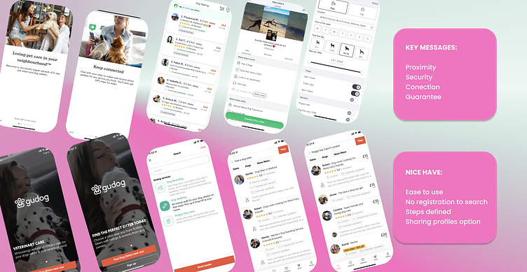
Most Dog Walking Apps have the essentials to sign up and explore, but a massive wall prevents users from booking a sitter, and it's the first time experience. Not having enough reviews or having none at all meant the world to our interviewees.
After brainstorming sessions with the team and mentor, we found several frustrations like pricing, distance, profiles with low-detailed info, special needs pets, and more.
Still, Trust was the biggest.
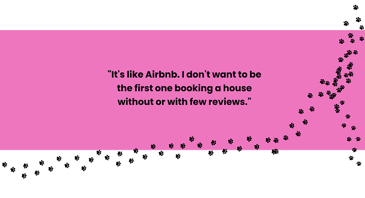
TRUST as the main painpoint
When reviewing the other players in the market, they try to solve the main painpoint, TRUST, with several key elements from copy to icons and colors. These were the highlighs that helped me define my Pet Shop App:
And all this, brought us to the Buyer Persona profile, and curious enough, this big headline echoed in my head:
Dog or baby?
I realized most millennials and centennials interviewed preferred pets to a child. And here's where my primary buyer persona came alive:
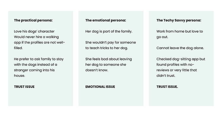
Buyer persona
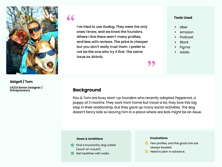
Abigail & Tom are a millennial couple whose one of the most significant step in their relationship was adopting a dog, Pepperoni. They are startup founders, so pretty techie people are used to testing new apps and probably the first users of many. They tried using other dog walking apps, but the reviews part was a trust issue for them. They are dog parents who invest a lot of money and time in getting smart toys, providing active pet education, and hiring training sessions at their favorite pet shop.
And here's where the first idea came into my design thinking process: a Pet Shop.
Pet Shops or Vets are the most frequently visited (physically/online) businesses, trusted by all types of personas (millennials, centennials, seniors). They all go to a trustworthy local store to find stuff and care for their furry friends.
So, what if....
2. The solution
Your local pet shop caring app
When asked our interviewees: Do you trust your Vet? Do you trust your dog's hairdresser? The answer was: "Absolutely. If not, I wouldn't come back."
That's where I pivoted my initial idea, fortunately enough the User Flow needed just a couple of adjustments. The end goal was still to provide a tool where pet owners could easily find a local professional to take care of their furfriends. So I went from an open dog walking App to a Pet Shop Dog Walking App.
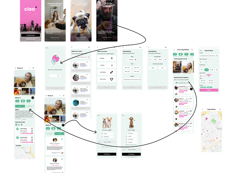
User flow
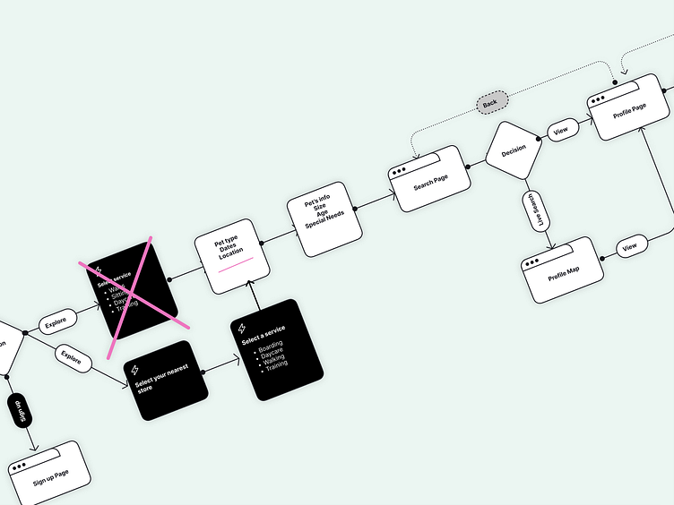
It's not just a regular dog-walking app; it is a white-label app for Pet Stores that would like to offer these types of services to their local customers. A marketplace for Pet Shop Owers to showcase their fantastic crew, such as trainers, walkers, nursing services, or boardings.
There was one thing obvious: the first experience (meaning downloading the App) needed to be highly frictionless. No need to sign up to explore was a must. And the focus was there on being able to search your brand's nearest store, which you trusted for years or months if you are a newer pet parent ;)
So allowing exploring profiles allow you to feed your curiosity without committing to anything. Knowing from the beginning that the profiles you're looking at are the store crew meant having a qualification seal.
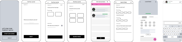
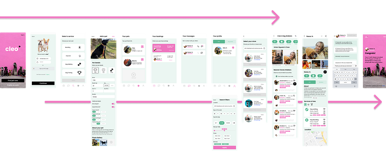
Wireframing
Wireframing was an incredible process, where just the greatest job was to reduce to minimum the number of components needed to accomplish the one goal: find a sitter.
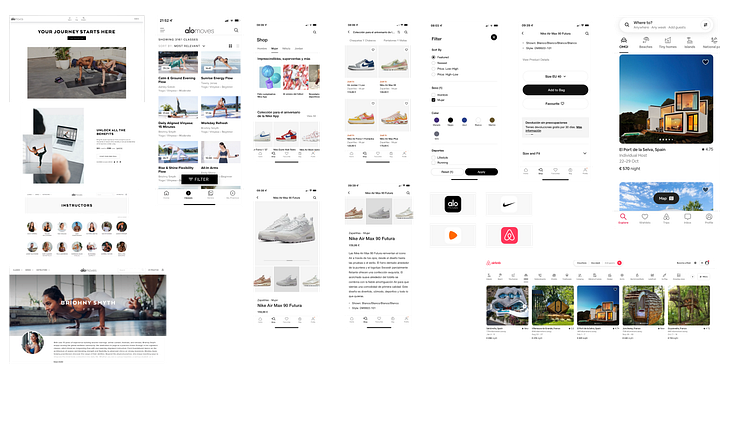
The approach to visual design
When doing the research, we studied several dog walking apps such as Rover, Gudog, or Meet My Doggo. When working on the mood boards, I opened the study to other cool apps such as Nike and Alo Moves and focused a lot on how pet e-commerce showcased their products.
Two things defined the visual design of the Cleo App:
Simplicity
Natural colors vs. a daring Fuchsia.
Simplicity:
Nike App was the inspiration to apply simplicity. Adding a few crucial elements on each screen and keeping air between components with a few texts was challenging.
The core was to address the elephant in the room and find the right profile based on the Trust of your local pet store:
Trust: Professionals from your local stores.
Searchability: easily find your local stores' professionals to book
Service selection: Present the options based on selected services and add some rare findings. You might be looking for a walk for your furry friend but find the dog trainer who will help your pet get fitter and participate in dog-trail races!
Availability: You'll get a list of available profiles based on your selected dates and times. And also, you can first book a 1o1 to meet with your pet's carer before anything to see if this is a good match.
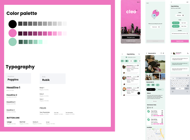
Color palettes & typography
When looking at the many Dog Walking Apps, most of them evoking a color palette based on nature, it was clear that I wanted to add some spice to the design. A daring fuchsia for pumping up some elements, and a green to transmit joyfulness and trustability.
Somehow green was important during the whole process. A nice background mint color made the app look cheerful and friendlier.
Prototype
3. The learnings
We then came to prototyping and testing. Here's where some problems arise, and I decided to apply some changes.
Some of the problems & solutions along the way:
User testing 1:
Filter tags: Initially, I based my study on Airbnb, adding some icons as quick filters in the search result, trying to add a shortcut to find a specific profile based on standard filters like Top Rated profiles, profiles with some vet knowledge, profiles with garden or the UFO sign for super Rare findings. But it confused the interviewees because they couldn't recognize the meaning only with the icon. So I considered adding a text right under to auto-explain.
Back arrows: this was a huge pain point that showed my lack of experience with design and Figma. The little arrows weren't returning to the previous screen due to a small area where to tap. I changed the strategy by applying bigger areas behind specific buttons and actions to smooth the experience.
Where to go next: after finding their match profile and being able to "talk" with them, it was like the user was waiting on something else. Where do I go from now? What should I do? Then, I had to study more about what happened after booking with Rover to find out you're redirected to your home screen to book another service. I understood the meaning of this action as a way to engage users in another service and immediately applied it to the prototype.
User testing 2:
Confirmation screen: clearly, the process was quick and easy to follow. But the end, where the confirmation screen popped up, somehow left the users disoriented. So I added a more explicit CTA to this screen: close and go back to your home screen or Add a pet if you haven't done it before.
Book 1o1 appointment: it was confusing that the first meeting needed to be a 1o1 with your instructor/carer, so I decided to explain it better in the process with copies that clarified why. The reason is that being Trust the main issue you might not know the carer from your local store, but you can do a quick video call to get to know them without any commitment.
Conclusion
There is something that I have applied over the years: you don't have to do it all by yourself, as there are professionals from each area that will do your job a thousand times better! As you may have noticed in my Pet Store Dog Walking App, I still have a long way to go at the design level, but I have been lucky enough to study with great colleagues and mentor with incredible talents. It is something for which I am very grateful.
A learning experience that was very enriching and that I recommend even to profiles like mine, outside the whole field of programming or design!
The most important part of the process to me was to bring something to my current role. And it did. The design systems and the strategic thinking I applied to develop an easy-to-read app, changed how my team and I approach challenges.
Overall it was a great learning experience and a growth opportunity.