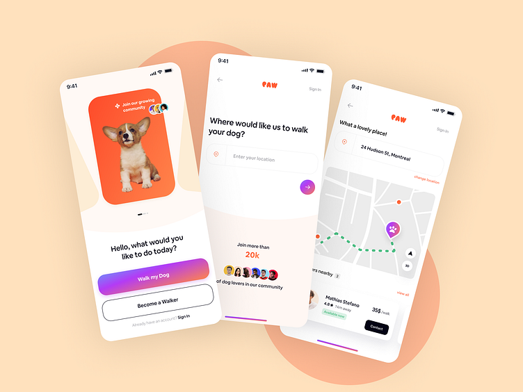
Case study on Paws, a dog-walking app 🐕
Here’s a breakdown of the process of designing Paws—a mobile application that offers busy pet parents an accessible alternative to walking their pets.
The aim behind Paws is twofold: offer an alternative service for occupied pet carers—and help dog-walkers make some extra income.
The process began with a research-based approach in order to clearly define the problem, and the avenues through which the application might resolve them.
This case study will go through the different steps taken in order to research, analyze, and ideate the Paws application for a successful delivery.
The Research
Kicking-off the project with a research-based approach that targeted two specific avenues:
A market research was conducted in order to find, analyze, and compare any similar dog-walking solutions that already exist. This gave an overview on the current market, and an understanding of what these comparable solutions offer, and what they lack.
Then followed research interview questions, in order to validate ideas and potential concerns users might have. This gave a clearer understanding of what pet-parents would be worried about, what services they already use, and which aspects services lack.
Persona & User Flows
The next step was to gather the information acquired through research to establish a user persona ahead of building flows. The persona serves as a fictional user that encompasses the findings of our research to give us a clearer idea of our ideal user.
With the information gathered and an established persona, the next step entailed building user flows.
Below is an example of the initial user sign-up flow:
Wireframes
The next task was to draw the first iteration of the Paws wireframes. The three initial wireframes focused on onboarding the user, finding a dog walker, and payment confirmation.
Visual Designs
Now that the app’s wireframe is established, we move to the ‘making it pretty’ part of the design.
The design inspiration process begins with setting up a moodboard for ideas and inspiration before getting into the nitty-gritty of the design.
The goal was to create a warm and intuitive interface, that gives an air of modern design while keeping a touch of accessibility.
This is why the Paws app adopts a warm color pallet with the use of gradient in buttons. This gives a sense of a human-touch, while portraying an air of confidence and modernity to give a sense of reliability. This creates a differentiation vis-à-vis existing apps, and visually eases potential users’ trust concerns.
Below are the screens for user onboarding, finding a dog walker, and the in-app chat feature. Given the concerns that pet-parents might have for their dogs’ security, an in-app chat seemed a necessary feature.
Components and Logo
Below are more details regarding the design of Paws, including the component library, font selection, and the color-scheme.
The font used in this application is DM Sans, a geometric sans serif that beautifully combines purity and warmth, striking a perfect balance between functionality and accessibility.
Keeping in line with the theme of accessible modernity, the Paw logo aims to portray a feeling of comfort and joviality.
Testing & Prototyping
Once the prototype was established, it allowed for ideation testing and revisiting relevant user flows. The primary flow that was validated through this testing process was the idea of a belated signup prompt.
As some apps traditionally begin with a user signup prompt before the user gains access, this prototype allowed to test and validate an iteration where a signup prompt is triggered after the user requests a walker.
Key Lessons Learned
Research is the key to learn what’s already available and what solutions are lacking.
Product design is an inherently holistic and collaborative practice.
Sometimes less is more in keeping an application intuitive.
User research is as important as market research to discover pain-points and implement relevant features.
Conceptual concerns can be solved through warm and accessible look-and-feel.
Testing and ideation lead to the most accurate results.
Thank you for taking the time to read my case study for the Paws dog-walking app. It was a great experience to combine a pragmatic approach with creative processes; while learning the in-depth process of product design and the many versatile aspects that go into it.


