MANZIL - Case Study
Brand Identity for MANZIL - Halal Financing & Investing Solutions
Overview:
Based in Canada, Manzil is a Canada’s First Islamic Digital Bank that focuses on halal investments and a myriad of financial halal solutions. Considering rebranding, they came to me in 2020 with an outdated brand that didn’t reflect what they did and discussed the possibility of a revamp that effectively portrayed their vision while reflecting the brand’s Islamic identity.
Early explorations
Finalization
The Concept:
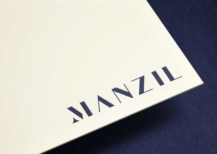
Starting with the M in Manzil, I wanted to explore typography in a manner where I could fulfill the requirements given.
Hence, I crafted the M with three aspects, a North Star that symbolizes guidance, an A that stands for Allah Azza wa Jal and finally, an M that is the first letter of Prophet Muhammad (SAW), emphasizing adherence to his Sunnah.
The North Star is a symbol of spiritual guidance that points towards the heavens upwards, therefore holding religious significance and standing prominent as an Islamic ornament. The North Star, combined with the A and M, made for an exemplary beginning to the overall brand identity.
Colour Palette
Previously, Manzil was based on a theme involving blue and golden. However, with the rebrand, pastel color was selected. In terms of the colors, the selection was such that they could act as a substitute for different backgrounds and as an intermediary when distinguishing between two words in the name.
Typography
I chose Sofia Pro font for English, as it was in tuned with the classic look and feel of the Manzil logotype. As for Arabic, I went with Tajawal.
Brand Architecture
I picked a North Star from the M of Manzil, which I then applied in all the different products of the brand. In this process, I experimented with a variety of colors for showcasing variations in the products.
Pattern System
The pattern system, utilized in different merch for the brand as well as in marketing borrows the upward star from Manzil’s M, alluding to the business while epitomizing success. Moreover, the M star has been used in a variety of ways in the rebrand, including with transparency.
Brand Applications
Some of the pattern systems applied in brand applications.
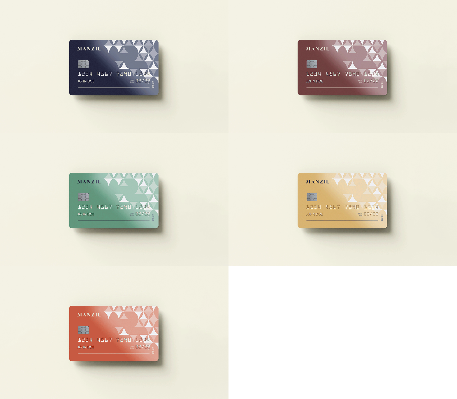
Halal Credit Card
Since Manzil boasts of a diverse range of products, they wanted customized credit cards that accurately echoed the nature of the product. Catering to their request, I came up with different designs for the tailor-made credit cards.
'We contracted Effendy to work on our logo/branding/corporate identity. It was a great experience, he was very patient and attentive to our direction and vision. His process and approach are very professional and he is a pleasure to work with. You truly feel his passion and dedication for the work he is doing and that he is invested in achieving the best result.
Our brand is regularly complimented by our stakeholders, and the team has truly felt our re-brand is aligned with the vision and mission we are striving to achieve. I would highly recommend him if you are looking for someone to get your branding done.'
–
Mustafa Elkalza, CPA, CMA
Chief Financial Officer at Manzil
Deliverables:
— Logo Redesign
— Visual Identity System
— Collateral Design
— Brand Guidelines
‣ Got an interesting project in mind, Contact me on my website


