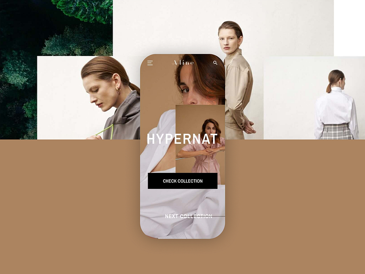
Fashion e-commerce luxury experience
Maintaining a balance between simplicity and complex concepts can be difficult to translate for digital, especially when we are talking about fashion e-commerce experience. With our client A-Line, as we decided to go big on the homepage through the addition of complex sections, we then toned everything down when we were developing the catalog and single page. That allowed us to have some balance between high-layered contrasted images and clean minimalistic white space canvas.
We built an experience on mobile that was closer to a native app and tried to simplify navigation to the max. Catalog and single page were the main focus, while storytelling sections remained with the "editorial" feel from the homepage.
Design and developed by Miew.pt for our client A-Line


