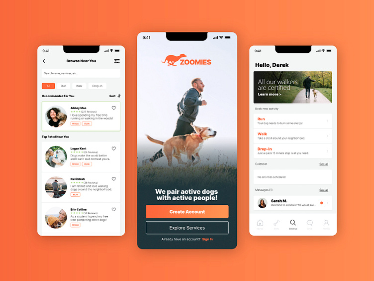
Zoomies: A Dog Activity App
Hello! This project was completed as part of the Dribbble Product Design course. The course includes a deep dive into the creative process required to produce purpose driven products such as this.
The Challenge
There are a lot of dog walking apps on the market. However there are no apps that directly serve someone who lives an active lifestyle. Sometimes a short walk is just not enough for a dog who is used to running several miles a day and has a lot of energy to burn. Dog owners need a solution that offers a variety of activities from trustworthy caretakers.
Who will use this app?
I created a user persona to serve as a representation of who I am designing for. All of my decisions will be run through this filter of “Are we solving a problem for users like this?”
Key Takeaways
After creating the persona and conducting interviews I created a list of features and challenges I would seek to address in my app. First, our target audience is very familiar with activity tracking apps.(Garmin, Strava, Apple). They want to see their dogs activities like they see their own on tracking apps. Such as a map, pace, and other data. Trust is also very important to our users.
User Flow
Now that I had a clear direction on where I wanted the app to go, it was time to start designing the functionality of the app. I started with the user flow so that I could see the inner function of the app and optimize the user experience before going too far in the creative process. As I began creating the user flow for the onboarding process, I wanted to eliminate as many clicks as possible for users.
Wireframes
Once the user flow was completed, it was time to start laying out the user interface. I started with quick sketches to quickly work out some ideas before moving to high fidelity wire frames in Figma.
Moodboard/Branding
Now that the flow and functionality of the app were complete, it was time to establish branding. I chose the name Zoomies to best target those who have high energy dogs. The look and feel of the app resemble common fitness community apps such as Strava, Garmin, and Apple. I wanted the users to feel like their pet was getting the same high end fitness tracking that they are already used to.
Visual Design
With the brand created, it was time to update the wireframes to match.


