Fluid: A seamless email experience
The tool that finally gives you a seamless email experience.
Design Brief
Let's be honest: no one enjoys dealing with their emails.
Most email applications are bulky and "noisy". It's simple to lose an email you want to read while replying in the same thread. And it's far too easy to allow an unholy amount of emails to pile up (not talking from personal experience or anything).
Despite all this, email isn't going anywhere. But that doesn't mean we have to continue accepting it for what it is.
(View the final prototype here.)
Introducing Fluid:
Unlike other email tools, Fluid aims to give the user a seamless email experience by cutting out the noise while making it simple for users to view their whole conversation with a person as they're replying.
A sleek interface, easily identifiable tags, and "canned" responses can help users waste less time and get back to doing what they love, faster.
Problem Statement
Since texting has become the main form of online communication in many people's everyday lives, it's no wonder that email feels incredibly clunky. Unfortunately though, modern entrepreneurs & freelancers can't expect all of their clients to join a business messaging app like Slack (nor is it cost-efficient for them to do so).
Since wide-spread adoption of a completely new tool seems unlikely, the compromise is to create an email tool that provides a "chat-like" feel to a user's communication.
Design Process
Research:
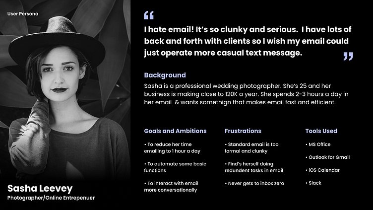
As always, the first step of this project was to conduct research to better understand users' pain points and the opportunities they saw for improvement.
Based on my research, I created a User Persona that captures the frustrations many young people and freelancers feel toward email.
User Flow:
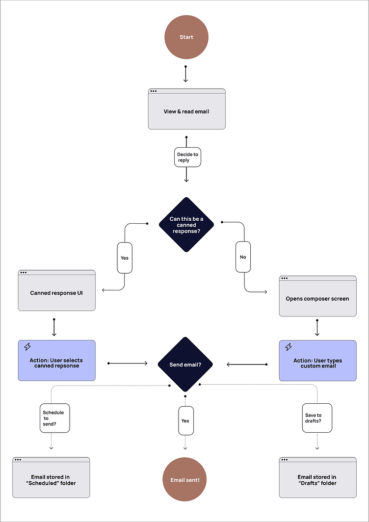
Next, I created Fluid's User Flow. I wanted this flow to be extremely simple for the user so they could send, save, or schedule an email as quickly as possible.
Wireframes:
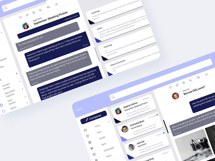
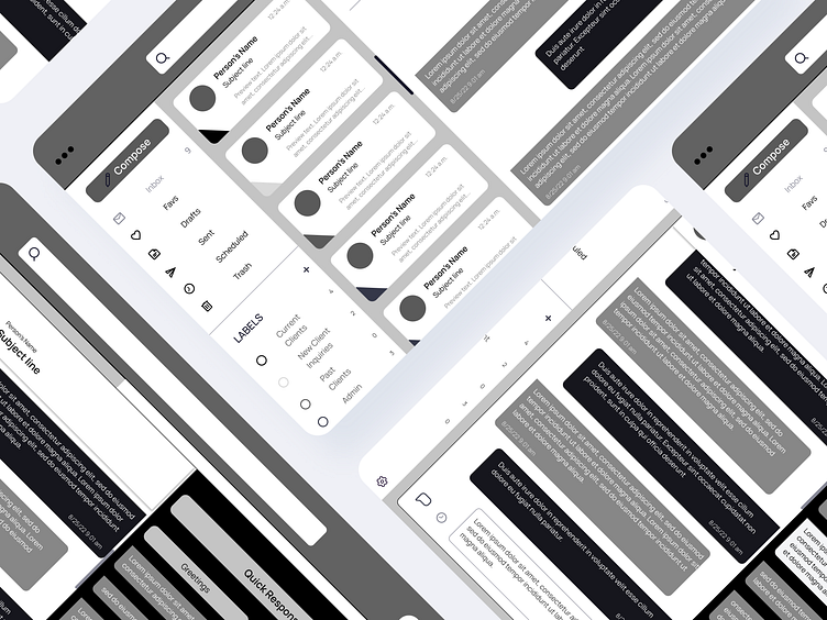
When creating the Wireframes, I focused on keeping the interface simple and "clean." Since one of the user's main frustrations is that email is "too clunky," I included color-coded tags so the user can easily see the organization of their inbox at a glance.
The user is looking for a tool that's "fast & efficient" as well. I included "canned responses" so the user can create answers for frequently asked questions. To help the user stay organized, they can even categorize their responses in their settings & a color tag is assigned.
Lastly, I made the email content itself appear as if it were a texting thread. The color differences allow the user to quickly tell who replied last and it's easy to read the whole thread, so they can easily scroll through their conversation.
The most important part of this feature is that it's easy to reply while reading other messages within your thread, instead of reading a previous message and then scrolling back to the messaging box at the bottom of the page to respond (I'm looking at you here, Gmail).
Visual Design Elements:
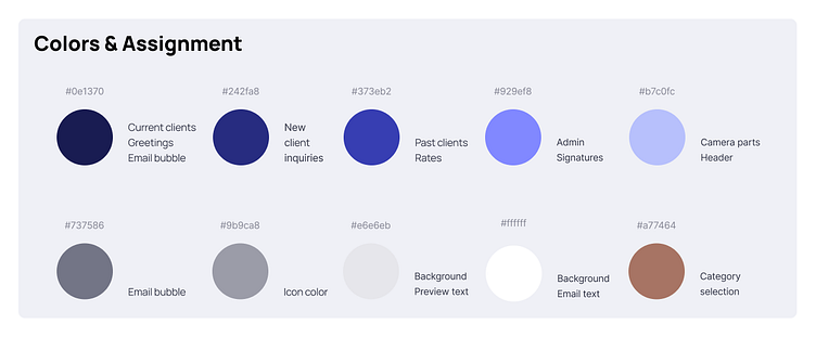
To bring the wireframes to life, I utilized white along with shades of grey to give the app a minimalist tone. I then incorporated different shades of blue for the user to filter & tag different emails.
(If this app where real, users would be able to select their favorite color and then create their tagging hierarchy based on the different shades of that one color so the tool would continue to have a clean style to it.)
Visual Design:
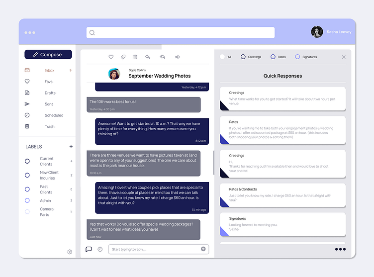
The final result was a sleek, email tool that allows the user to quickly select a canned response.
The canned response page also allows the user to type a custom response without being able to see their current inbox. This was an intentional design decision because users who are replying to an email are often distracted by incoming emails.
Want to try it yourself? See the prototype in action here.
Learnings:
My primary takeaway from this project is how powerful the auto-layout function in Figma is. Almost all the components in Fluid have been placed into auto-layout to guarantee even-spacing. Auto-layout also allowed me to quickly change the text in the email chains because the chat bubbles would automatically adjust.
Looking forward:
For an email tool like Fluid to function, there'd have to be dozens (if not hundreds) of user flows for it to be complete. While my prototype lays out sending a "canned response," if I had more time I'd like to build:
The scheduled email response & scheduled email folder.
An incorporated calendar so the user can easily select a date & time to send an invite to a client (instead of them needing to use a different application or type out a suggestion).
Group email threads. With a group email, I envision the chat bubbles having each person's picture or name on the corresponding bubble while still only using two colors, but different shades of color could be tied to emails from different individuals if user research showed that potential users would prefer that.
Lastly, I would conduct more research and ideate on the final prototype further.
Let's Chat
If you have any questions or comments, don’t hesitate to put them in the comment section below! 👇
