MANZIL
Brand Identity for MANZIL - Halal Financing & Investing Solutions
Overview:
Based in Canada, Manzil is a Canada’s First Islamic Digital Bank that focuses on halal investments and a myriad of financial halal solutions. Considering rebranding, they came to me in 2020 with an outdated brand that didn’t reflect what they did and discussed the possibility of a revamp that effectively portrayed their vision while reflecting the brand’s Islamic identity.
Full case study tomorrow. ✌️
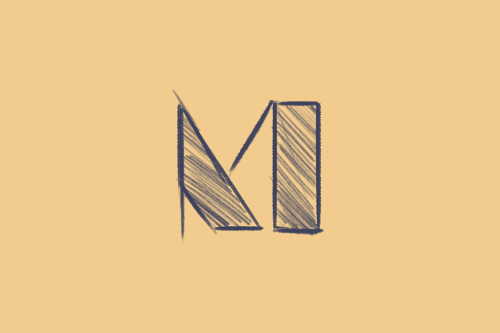
Starting with the M in Manzil, I wanted to explore typography in a manner where I could fulfill the requirements given.
Hence, I crafted the M with three aspects, a North Star that symbolizes guidance, an A that stands for Allah Azza wa Jal and finally, an M that is the first letter of Prophet Muhammad (SAW), emphasizing adherence to his Sunnah.
The North Star is a symbol of spiritual guidance that points towards the heavens upwards, therefore holding religious significance and standing prominent as an Islamic ornament. The North Star, combined with the A and M, made for an exemplary beginning to the overall brand identity.
Previously, Manzil was based on a theme involving blue and golden. However, with the rebrand, pastel color was selected. In terms of the colors, the selection was such that they could act as a substitute for different backgrounds and as an intermediary when distinguishing between two words in the name.
Deliverables:
— Logo design
— Visual Identity System
— Collateral design
— Brand guidelines
‣ Got an interesting project in mind, do not hesitate to contact me on my website


