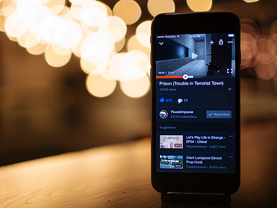
YouTube for iPhone Redesign
For the fifth week of my personal design challenge, I worked on an unsolicited redesign of YouTube for iPhone. This screen is a dark UI for the video player. You can read more about the challenge and the decisions I made on Medium:
Redesign Challenge (5/52): YouTube for iPhone
Any suggestions for what to tackle next? Let me know in the comments or on Medium.
Take a look at the real pixels.
More by Evan Dinsmore View profile
Like

