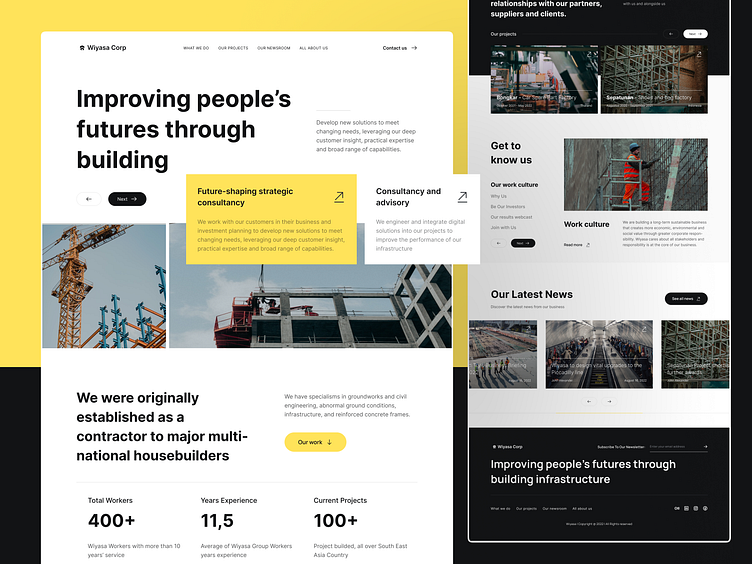
Wiyasa - Construction Company Website Design
Hola guys!
Take a look at a new design about Wiyasa, a Construction Company Website Design. In this exploration, I tried to explore more about the layout positioning and typography
Wireframing🧩
In this step, I tried to explore more about layout positioning and information architecture. With a lot of information and text to be displayed, I try to craft it into a neat, unique, but still clean layout
Hi-Fi Design🔥
And finally, with some gradient and coloring magic, our designs are ready to be developed
Full Page Version🤟
Thanks For Scrolling😉
Hope you guys like it! Cheers for checking out. Please share your opinion in the comments section and don’t forget to press “L” if you love it.
We are available for new projects
📪 Email: hello@vektora.studio | 🌐 Website : Vektora.studio
🎯 Skype: Keep in touch 😀 | 👋 Instagram: Vektora.studio
🛍️ Ui8: Vektora Shop | 💰Gumroad: Vektora Gumroad


