Circle Percentages
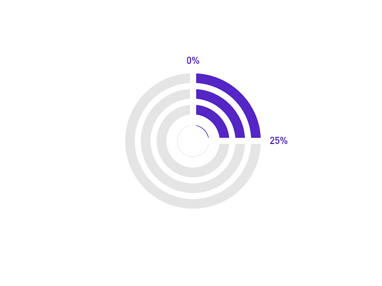
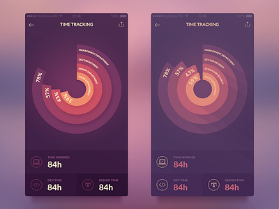
So the issue with using multiple circular layers as percentages is the confusion it causes.
If we glance at the three bars in the dribbble above, we quickly assume the one outside actually carries more weight, is a larger percentage than the inner two. However this is not the case. The viewer has to spend that extra second reading the percentages of each bar to discover that they are actually the same percentage.
I highly recommend reading: The Wall Street Journal Guide to Information Graphics by Wong, Dona M
More by Fritz View profile
Like

