Walk | UI/UX Case Study + Brand Design
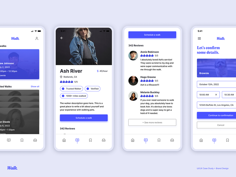
Walk is a concept for an application that directly connects dog owners to dog walkers. With a focus on trust and security, Walk aims to alleviate the stress of scheduling appointments with walkers, and bring peace of mind to pet owners that their best friends are in good hands.
My role in this project included user research, brand design + direction, and UI design + prototyping.
Timeframe: June 2022 – September 2022
Research Methods: User interviews, market analysis, user personas, wireframing, prototyping
Tools: Figma, Adobe Illustrator
This project was created as a part of Dribbble's 2022 Product Design Course.
"Dog owners sometimes need help caring for and walking their dogs. We need to create a service to connect dog owners with dog walkers. Consider how we can help dog owners trust their dogs are in safe hands."
Pets are so incredibly important to any family that has them. They're always there for us, and they always love us unconditionally. Naturally, it's hard to entrust them to other people whenever we need help caring for them — especially if they're a complete stranger!
When setting out to create a solution to this problem, we asked ourselves this: How can we create an application that reinforces the pet owner's trust and confidence to book a walker, and how can we make that process as simple and easy-to-navigate as possible?
User Interviews
We conducted user interviews, and found that some key takeaways included:
1. Users do not have enough time to walk their dogs when they need to.
2. They strongly distrust unresponsive walkers.
3. They want to be able to track their pet + walker in real-time.
4. They also want to be able to contact their walker directly.
Market Analysis
We also analyzed the different products that are currently on the market. These products included Rover, Wag!, and Barkly.
User Persona
Through my research and analysis, I developed a user persona that I felt best encompassed the primary demographic of this potential application.
User Flow
I began the design process by constructing an initial idea for a user flow. While some specifics ended up changing through the app's different iterations, this gave me a great foundation to begin thinking about the different pathways a user might take, as well as accounting for various edge cases.
Wireframes
My next step in the process was to create some low-fidelity wireframes. This also provided a great foundation for me to begin figuring out the app's ergonomics. I really wanted to focus on utilizing cards to display information, since I felt that was the best way to consolidate elements like names, dates, times, and so on.
Visual Design
After finalizing the wireframes, I decided to start applying some branding and visual design. I wanted the overall brand direction to feel clean and professional to invoke a sense of trust and confidence, but still feel friendly enough that it's not scary to use.
Conclusion + Next Steps
Unfortunately, due to time constraints, I was unable to perform in-depth user testing and receive prototyping feedback. However, the end of this course does not necessarily mean the end of this project, and I'd love to continue building on it with extra testing, feedback, and iterations.
Overall, through creating this application, I absolutely learned a ton about user research and visual design. As a pet owner myself, I had a lot of fun designing this concept in a way that I felt would be pleasant to use! It was also a great exercise in brand design and direction.
Thank you for viewing!


