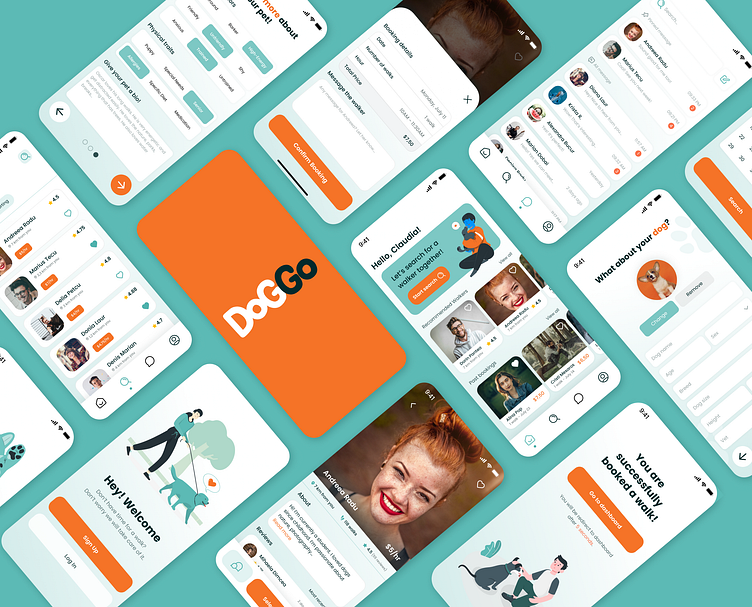
DogGo - Dog Walking App 🐶
This dog walking app was completed as a part of Dribbble's Product Design Course in Figma. We were given a project brief, weekly check-ins, and brainstorming sessions, but the end result was up to us.
Problem Statement & Research
To begin with, we were asked to identify pain points with current dog owners when they’re looking for walkers for their furry companions.
I decided to focus my assignment on the Romanian market, as all of the users I interviewed are from there. I talked with users who have and also haven’t used a professional dog walking service. Their main preference would be someone they are familiar with, a trustworthy professional, and more importantly, an animal lover.
After doing my research I discovered 2 main issues:
a lack of services that provide dog walking/sitting (in Romania)
trust is essential on both ends of the experience
User Personas
My user personas reflected a mixture of the four people I interviewed. I crafted them based on some of the challenges they were having to better identify with the user.
Their motivations are built around trust and quantifiable qualifications. Working around a busy work schedule, they want a seamless and trustworthy app where they can select a professional and experienced walker for their dog.
User Flow
a) Initial Version
At the beginning of the course I did a user flow for the Sign Up and Search (dog walker). I kept it simplistic and easy to understand. At this stage, I was completely new at designing user flows but I enjoyed the process a lot.
b) Final Version
After reviewing and testing out the initial user flow with my colleagues and mentor, I identified a few improvements that I wanted to make to it.
With this in mind, I created an upgraded and final flow for the Onboarding, Profile Builder, Search (Dog Walker), Chat and browsing from the Home Screen.
Wireframes
In the next step, we were asked to do two versions of wireframes - Sign Up and Search (Dog Walker) flows.
Two key elements that I wanted to reinforce in the wireframes were - the simplicity of use and, additionally, building trust between users and dog walkers.
At the same time, I wanted to integrate trending components such as carousels, drawers, rounded cards, and buttons to give the app a modern look and have similarities with other on-the-market apps in terms of usability.
Moodboard
Before moving into the UI phase, the next focus was on creating a mood board to reflect the fun, friendly and modern approach that I envisioned for the app. This process allowed me to uncover key visual elements that would help me create the DogGo brand.
Style Guide & Visual Components
I was adhering to a simplistic design using a bright shade of green as the primary color to promote feelings of friendliness, liveliness, and freshness. I wanted to focus on the mobile app’s easy-to-use functionality.
I chose to stick to one main color and use a gradient of that for the background to have continuity. However, I still added different elements and colors to make certain elements and components pop.
By using Poppins as my font for the app, it complemented the soft graphic shapes, and rounded button corners I included in my design. This font is great for both headlines and paragraphs to improve readability and style.
Together these elements create a playful and inviting visual identity.
Final UI
As a final overview, the core pages that I wanted to highlight in this case study are Home, Search (for walker), and Profile (walker).
a) Home
Has an invitation card with a search function included, recommended walkers, and past bookings in a horizontal scroll area. Each walker's card contains core information about their service and hourly fee.
b) Search (for walker)
Has a list of vertical scrollable cards that has all the details included on the home page. You can filter the cards by choosing the location, date, starting time, and duration. Also, you can see the date in a monthly calendar form.
c) Profile (walker)
Displays a prominent photo of the walker, distance, rating, hourly price, and how many walks he has completed. The page is completed by the About section and the Review cards in a horizontal scroll.
From here, users can book the walker's service, send them a message, tap on the favorite button or go back to the search page.
Final Thoughts
At the beginning of June, I started on this journey called Product Design as a complete newbie. Through weekly sessions, together with my colleagues and mentor, I learned important lessons starting from user interviews, flows, and wireframes to how to completely design a modern and easy-to-use user interface.
Thank you to Taya Yamenko for the weekly mentoring sessions, and feedback and for always being available whenever I had a question. To our main designer and inspiration Jesse Showalter for the great course materials that I will constantly come back in the future and last, but not least, to Dribbble for making this course available for aspiring designers like myself.
Excited about what the future holds ahead! ✨
__________________
Love this case study? 🧡
Subscribe for more future shots and don't forget to press L before you leave!


