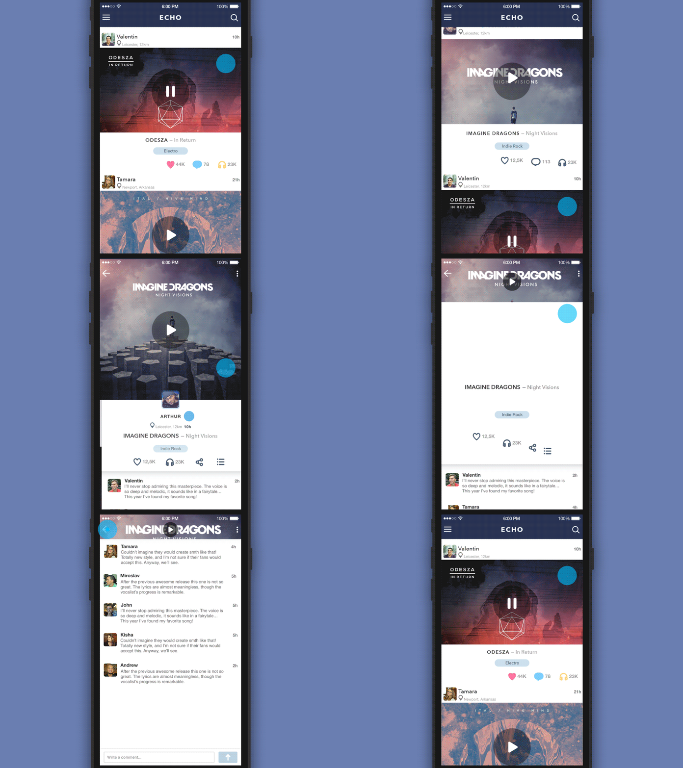
GIF for the ECHO App v2.1
Hello from Ukraine! We are still alive and ready to work :) Today I want to share with you a small piece of project that I'm currently working on. That's a redesign of the ECHO app. I know that there are so many music social networks in the market and they have the same functionality in general but ECHO is one of the best. Why? Because we spent a lot of time on UI and UX philosophy and tried a lot of different solutions. In the new design we are using simple shapes, white background and flat icons and we made an accent on animations. Not because this is popular now but to draw the user's attention to important details such as post body opening on feed screen or its vertical scroll. Thanks for watching, hope you'll like it (; Behance | Instagram | Twitter | Facebook | Tubik
