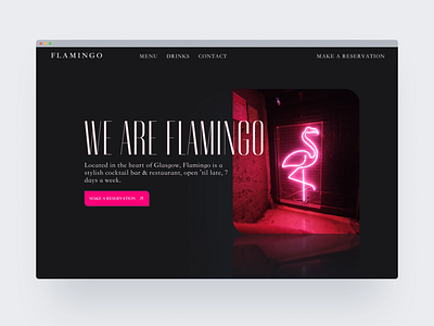
Flamingo Bar and Restaurant | Atom Design
Todays design was a bit different to our usual style, which was quite a fun out-of-the-box project!
When researching restaurant websites in our hometown of Glasgow, we found several of them cluttered and hard to use. When designing the homepage of Flamingo, we went for a minimal, 'less-is-more' style with a striking pink primary colour on a dark background, with the neon and soft reflections.
What do you think? Would you tackle this differently? Let us know!
Designed in Figma
Design system: Untitled UI
Future build: Webflow
(The above links may contain affiliate links, and we may receive compensation for any purchases made through them.)
______________________________________
More by Kelsie Murphy View profile
Like
