Komeet - Logo Design (☄️+🍴)
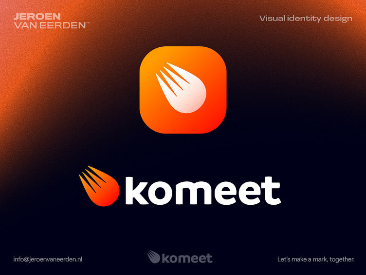
Komeet is a food service that means 'Come-Eat' + 'Comet' in Dutch.
I had this idea to refer to a comet as their service is moving at the speed of light. Funny thing is that the word 'Komeet' is a direct translation of the actual word 'Comet' in Dutch. Also, when separate the two words 'kom' and 'eet' it says 'Come Eat' in English. Extra detail is the fork which I wanted the Comet kinda looks like as well which helps to visually form this double-meaning symbol.
Looking to hearing about your thoughts and possible points of feedback.
Have a great day everyone! Jeroen
Are you interested in working with me or want to buy this logo concept?
Feel free to reach out via the Dribbble inbox or direct e-mail:
👉 info@jeroenvaneerden.nl
