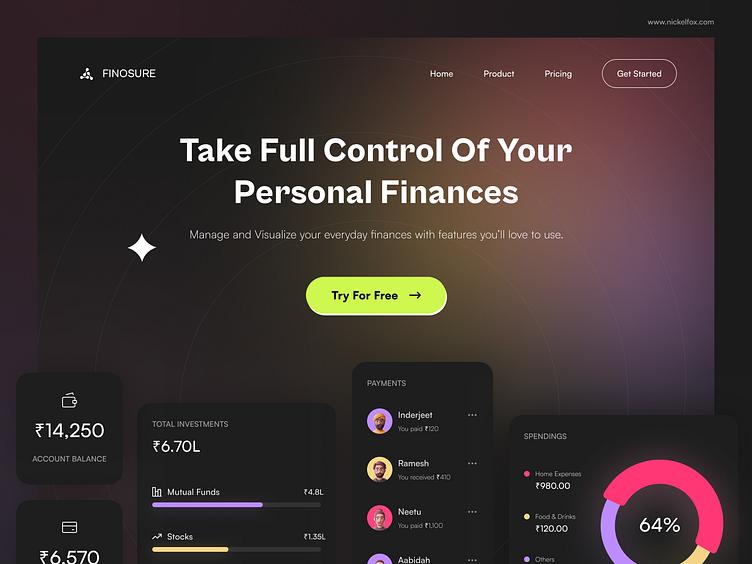
Personal Finance | Hero Section
Hello Dribbblers,
Do you find it crazy to keep track of all personal finances in your head? Here's a Personal Finance hero section concept that showcased the application components for better user engagement. We have created this design on Figma. Here are the specifics:
Colors -
(French Rose) #FF447E - used to form a bold gradient base
(Corn)#FFEC64 - used to form a bold gradient base
(Lavender Floral)#BD8DFF - used to form a bold gradient base
(White) #FFFFFF - primary white for text on dark background
(Eerie Black) #1E1E1E - used for component card background
Font -
Cabinet Grotesk (Extrabold) - sans-serif font, used for a luxury touch with its stylistic alternates
Satoshi (Light, Medium, Black) - serif font, used for a soft yet professional influence and to build authenticity
Asset Link or credits -
Icons are used from the Streamline icon set.
Techniques-
1.Textured gradient overlays
Our designer says - I wanted to make this concept look minimal and provide a touch of elegant through use of gradients. With its dark theme and poppy gradient background, this fintech domain concept has a luxurious appeal.
I hope you enjoy exploring this shot.
Don't forget to press "❤️" and comment.
Thanks :)
--------------------------------------------------------------
Download file link here
--------------------------------------------------------------
Have an idea? Let's talk here or WhatsApp
Follow us here:
