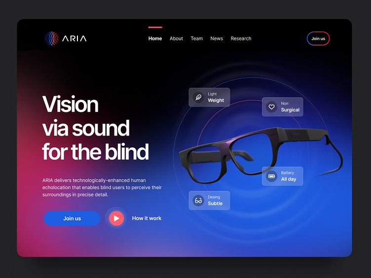
Home: landing page: website
👋 Hey all,
Client: ARIA - Enabling Vision for All
Project Overview: ARIA is a revolutionary bionic device designed to empower individuals who are blind or have low vision by providing them with enhanced spatial awareness and facilitating their navigation through the sight-centric world. The brand identity design project for ARIA encompasses the creation of a compelling logo and an accessible website design. The primary objective is to establish a strong, inclusive, and impactful brand presence that reflects ARIA's mission of enhancing the lives of people with visual impairments.
Challenges:
Inclusivity: The brand identity design must convey ARIA's commitment to inclusivity and accessibility, ensuring that the content is easily perceivable, operable, and understandable for all users, including those with disabilities.
Complex Technology: Communicating the sophisticated technology and benefits of the ARIA device in a user-friendly manner is crucial.
Emotional Connection: Creating a brand that fosters an emotional connection with users and showcases ARIA as a life-changing solution.
Phase 1: Logo Design
Research and Discovery: Conducted extensive research on the visual representation of assistive technologies, bionics, and accessibility symbols. Identified colors, fonts, and design elements commonly associated with inclusivity and empowerment.
Concept Development: Explored various design concepts, focusing on elements like braille dots, sound waves, and human connections. The key challenge was finding a symbol that visually represented both technology and empowerment.
Design Execution: Developed multiple logo iterations and refined them through feedback sessions with stakeholders. The chosen logo incorporates a stylized, circular eye with interconnected lines that symbolize both technology and unity. The color palette includes vibrant blues and warm, inclusive tones.
Phase 2: Website Design
Accessibility-Centric Approach: Collaborated with accessibility experts to ensure the website design adheres to WCAG (Web Content Accessibility Guidelines) standards. Prioritized features like alt text, keyboard navigation, and screen reader compatibility.
Content Strategy: Developed a content strategy that communicates ARIA's mission, technology, and user stories effectively. Used inclusive language throughout the site.
User-Centered Design: Created wireframes and prototypes with a focus on a user-centered design approach. Included features like adjustable font sizes, contrast settings, and voice assistance integration.
Visual Design: Incorporated the chosen logo and brand colors into the website's visual design, ensuring a consistent brand identity. Utilized imagery and infographics to explain complex technology concepts.
Testing and Iteration: Conducted usability testing with individuals who are blind or have low vision, incorporating their feedback to make further improvements to the website's accessibility and user experience.
Outcome: The brand identity design for ARIA successfully embodies the essence of inclusivity, empowerment, and advanced technology. The logo represents a harmonious blend of human touch and cutting-edge innovation. The website offers a seamless user experience, making information about ARIA accessible to everyone, regardless of their visual abilities.
Results:
Increased brand awareness and recognition for ARIA among its target audience.
Positive feedback from users, particularly those with visual impairments, for the website's accessibility and usability.
ARIA is perceived as a forward-thinking, inclusive brand that stands at the forefront of bionic technology.
Conclusion: The ARIA brand identity design project showcases the transformative power of design in conveying a message of inclusivity and technology innovation. By prioritizing accessibility in both logo and website design, ARIA has not only created a strong visual identity but also demonstrated its commitment to enhancing the lives of individuals with visual impairments. Thanks
Press L — to make me 😁
⭐️ ⭐️ ⭐️
UI and Graphic designer — Steven Gonzalez.


