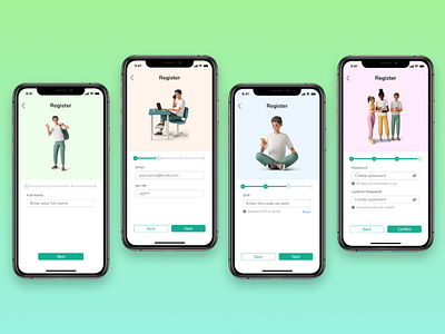
Multistep Registration Form
Hi all! 👋🙋♂️
For this month Dribbble shot I want to explain a little bit about "Step Form" and why it's used.
"Step Form" is used by UX Designer to eliminate intimidating long form that have lots of question fields.
User tend to get overwhelmed by the number of form they need to fill out during registration when they are feeling in a rush to try out the app; "Step Form" used to divide the question into few steps that proof less intimidating for user.
Citing from ventureharbour; users are more likely to fill out sensitive information (email, phone) on the final step of a multi-step form because they will lose the progress made in the previous steps if they didn't, it's based on proven cognitive bias known as the "sunk cost fallacy" (Taylor, M., 2022). Seeing progress bar also make users more motivated to complete the form (also based on numerous proven cognitive biases such as the endowed progress effect).
Hence, designers are encouraged to start using multi-step forms when needed!
If you have any feedback on the design, please leave a comment. I would love to read any critics and feedbacks 😉
Press "L", spread love! 💜💚
