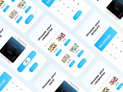
Monet - Money Transfer App UI Concept
Good Morning, Dribbblers!! 🌄✨
🧩 Introduction:
Today, I'd like to present my Exploration UI Concept for Money Transfer App, I've been working on recently.
📟 The Concept:
With this concept, the user can transfer certain amounts of credits to their recipient users using their actual real-world credit information with ease. The tooltips on each screen is responsible for guiding the user properly and prevent any confusion. This concept is made as simple and minimal as possible. This concept has been made with most of the accessibility standards in mind. It is based on the POUR principles upon the WCAG accessibility.
The color palette used in this concept includes sky-blue and azure-blue. This color palette is accented on the UI elements such as form submission and call-to-action buttons.
🎉 Gratitude:
Hope you like it. If you do, please enjoy this post, press "L" to support and don't forget to give some feedback. Thank you for your attention, everyone. Hope you have a nice productive day!!
