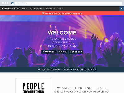
The Father's House Homepage
It's been a long 4 weeks, but I'm happy to say that the launch of the redesigned tfh.org is a great success.
User research, case studies, 3 years worth of analytics to sift through, information architecture, sketches, drafts, mock-ups, wireframes, styleguides, HTML, CSS, LESS, JS, jQuery, Twitter Bootstrap, Expression Engine, templates, tags, content entry, browser compatibility testing, and debugging.
That has already added up to over 2,000 visitors within the first 3 days finding exactly what they were looking for within seconds of landing on the homepage. New and returning visitors are discovering the vision and purpose of TFH, getting connected, giving, learning, and growing.
More by Kevin Ohlin View profile
Like
