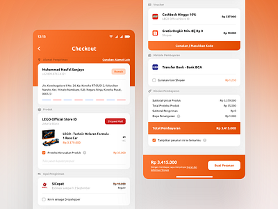
Shopee Checkout Page Redesign | App UI/UX
Somehow Shopee's checkout page is so intimidating to me and it gave me an anxiety, the page has so much text yet the white/blank space is so small. So I made this when I have free time, what do you guys think? TY!
More by Muhammad Naufal S View profile
Like
