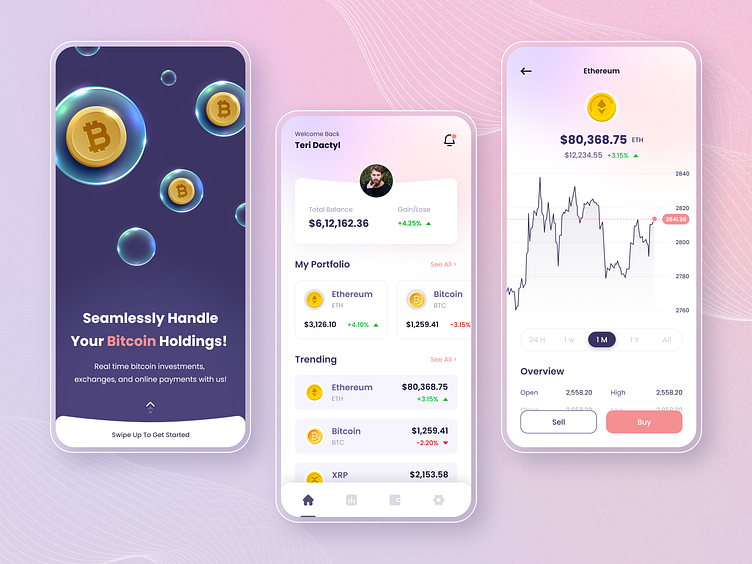
Crypto Currency App UI
As UI elements of websites and apps become more standardized, it’s the attention to the detail that differentiates the best from the rest.
When it comes to Cryptocurrency App Design all of us just really want to know one thing: how our portfolio is doing. Usually, you have to look at a percentage summary or you have to look at a list of numbers, requiring more mental energy to figure out what is going on.
Our goal with this layout was to condense this substantial bit of data into a "live, breathing visualization that would take little cognition and would be very glanceable."
The gentle gradient, combined with a few subtle nodes of contrasting colors, creates a soothing interface (a pleasant change when compared to the frenetic nature of the markets!). This user interface looks and functions much like a standard marketing or analytics dashboard, making it simple to use and drawing attention to the most pertinent data at a glance.
What do you think of this design? Press❤ "L" if you like it.
Tools: Adobe XD & Adobe Illustrator
Inspired by good designs? We can help you transform yours just the way you like it 👋 Drop a line at 📩 biz@cmarix.com or Visit Us - www.cmarix.com
Follow us for more amazing designs: Instagram || Behance || Uplabs
