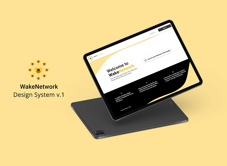
WakeNetwork Design System
WakeNetwork
WakeNetwork is a mobile-friendly, digital platform. Originally created for Wake Forest University in 2015 as a way for Wake Foresters to stay connected, and build new relationships with fellow Wake Foresters across the globe. It's also a one-stop shop for alumni and donors to register for events, monitor donor funds, and network.
Creating the first Design System for WakeNetwork.
Prior to 2019, WakeNetwork was hosted on Blackbaud's BBIS framework, which was difficult to style, and left little room for customization or accessibility. In late 2019 I tasked my software engineering team with rebuilding WakeNetwork from the ground up in React.
MVP for the rebuild was simply recreating all the current functionality and appearance on the new platform. I worked closely with our Product Lead, Lindsay Hudson-Ortyn to design the look and feel of the new site.
This was the catalyst for a design system.
Process
Role: Product Designer
Logo Design: Brent Piper, WFU
Our product lead transitioned to another company in early 2021, leaving me to tackle the design system. Having zero experience building a design system prior to this, I invested a significant amount of time in researching design systems and then determining the best place to start for us.
Audit
In late November of 2021, I began auditing our current site and its CSS to better understand what needed to be created, and what could be consolidated. I also focused heavily on accessibility, as the current site did not meet AA accessibility standards.
The results were as follows:
Summary of Audit Findings
The lack of standardized styling, coloring, and typography meant our developers were often left to decide what font, color, or size to use while coding new features. Without an understanding of what meets WCAG AA accessibility standards, and without an understanding of design principles, patterns or even what their fellow devs were implementing, we were left with many different looks.
This made for an inconsistent and at times frustrating experience for the user.
Timeline
Design System Creation
Overall, the WakeNetwork Design System took four months to audit and then create as a design team of one.
Tools: Figma, Adobe Illustrator
Design System Implementation
The design system took two sprints (four weeks) to implement in March of 2022.
WakeNetwork Design System Overview
Unique colors reduced from 38 to 8 accessible colors with unique names.
One unique Font Family implemented, and a typographic scale created.
Buttons were standardized and reduced from 19 different styles.
Standardized icons by implementing FontAwesome 6 Pro icons across the site. One custom WN heart icon created in Illustrator.
Forms made accessible with both placeholder text, dynamic labels and helper text.
Checkboxes, Radio Buttons, Toggles & Tooltips...all standardized and updated to make the contrast accessible.
Final Results
Development time for new features has been reduced by 50%.
Time needed to update or enhance the design of current features has also been reduced by 50%.
Work in Progress
Like all design systems, this is a living document.
As I learn more about design systems, and as Figma continues to improve its component feature, our system will continue to evolve and improve.
Additional Credits
Logo Design: Brent Piper, WFU
Design System Implementation: Jake Summers and Sharon Hartsell, WFU


