Pro Grid, Grid Pro

So I spent a little time the other week putting together an identity for our new little tool, Beagle. Obviously, there is more to an identity than just a logo – so I’m pretty excited to see this grow alongside the product as it also grows.
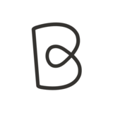
I’ve always had a methodological approach to setting up my grids, and this one was no difference. Using the classic “Phallicmorphism” grid structure I was quickly able to assemble a logo just from lines and circles! Magic? No. SCIENCE.
Here's a bit of a write up about the logo, and also a look at my internal presentation I never thought would go on the internet! Yay! Transparency!
Right, let’s get this bit out the way.
Looks like AirBnB Looks like logo Looks like Monogram Looks like measles Looks like weasel Looks like pastry Looks like rope Looks like Matthew McConaughey Looks like Coca Cola Looks like the shape of things to come Looks like rain Looks like identity Looks like The Bourne Identity Dad? Looks like fork Looks like dog Looks like Fedex Looks like me Looks like freedom Looks like teen spirit Looks like failure Looks like Shell Looks like bagel Looks like Steven Seagull Looks like pasta Looks like hello Looks like I'm so so so sorry. Really.