The Client's Guide to the Digital Illustration Process
The illustration process reflects very much the problem solving process that we all use in our day to day life. We assess what we must do, make general plans, refine them, then execute them. Often we just see the final work of artists, but like with everything, there's a lot behind the scenes.
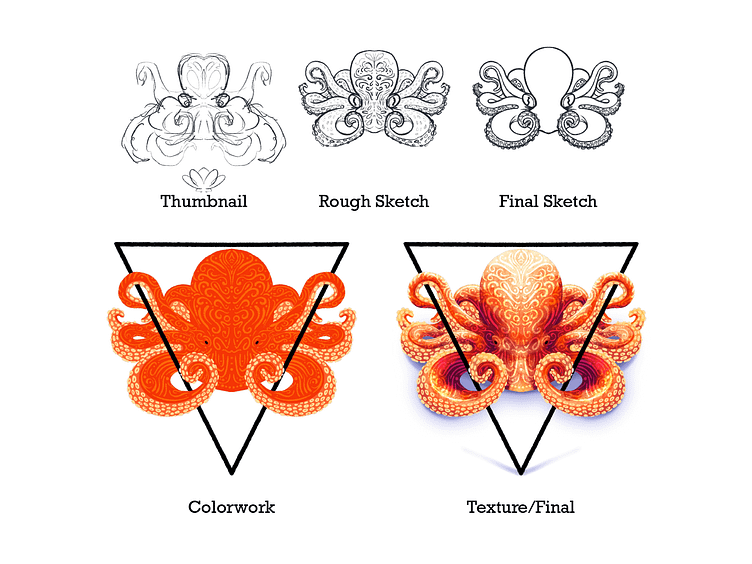
The Thumbnail
This is where the client and artist work together to find an idea that will meet the goal of the brief. It is more of an idea than a drawing. It proposes content and composition. There is no final line work here, just a suggestion of where it should go. And because we are not concerned about final execution, changes can be applied and removed in a matter of seconds and minutes rather than days and hours. This is perfect for seeing how content or product is influenced by an image even if it is no where near final. Once this is established, it becomes a graphical scope of work that the artist will create.
Rough Sketch
Using the basic outline of the thumbnail, we refine the rough scribbles into proposed final lines. Additional details will be added here, unnecessary parts removed, and the content refined. Some clients have a difficult time conceptualizing what a thumbnail will look like in final form, and this is very helpful to see. Changes are often applied at this stage, and some still can be applied. However after this point, changes take hours and days rather than minutes.
Final Sketch
This step takes the rough sketch and instead of focusing on clarifying the thumbnail, it creates the final shapes. We have gone from conceptualization to editing to finalizing. This will be the basis for the final inking and coloring. When the process is broken down in this way, it spreads the weight of the creativity to its appropriate and most effective times. Requesting content or composition related changes at this point will occur additional costs depending on the size. Below, we can see all three of these steps laid on top of each other.
Here we can see that some limbs have been removed as well as the shell. We tightened up the octopus on itself and decided to focus on it rather than the interaction it had with the potential food. In the next stage, a triangle was added to contrast between the organic shapes of the animal.
Shape Building/ Color Work
The way many digital illustrations are built are with layers. The limbs, body, suckers, patterning, and triangle are all on separate layers. This allows the artist to isolate certain pieces in order to apply masks, texture, color, and changes without disturbing the surrounding artwork. This image depicts those final layers without any shading added. Any changes regarding composition and subject matter will take much more time than if they were made at the thumb nail or rough sketch phases. Here, we focus on color, lighting, and patterning. Below we can see the rough sketch overlaid on these layers and the final coloring.
The creative process bends dependent on the project, and for this process, I kept the patterning only in the rough sketch with the intention to apply it more intuitively as the colors came out. This way I could see in real time what applying that pattern did rather than build it out in the conceptual phases.
Final Illustration with Lighting
Using the shapes and layers we built in the stage before, we apply light and shadow to the work- in this case using a texture brush. It goes without saying that lighting is how we instinctively know the shape of things, and it really adds so much dimension to the previously flat illustration. To emphasize the impact of the clean while background and geometric triangle, we added a soft, blue tinted shadow below the subject. Any changes at this point should be limited to the execution of the lighting and nothing else.
And that's the basic illustration process! Every project is different, every end result is different, but with this basic formula, we can successfully work from a small idea and build it into something beautiful.


